What a visit to the beauty trade show can tell nail brands and distributors about building a clearer gel nail polish range.
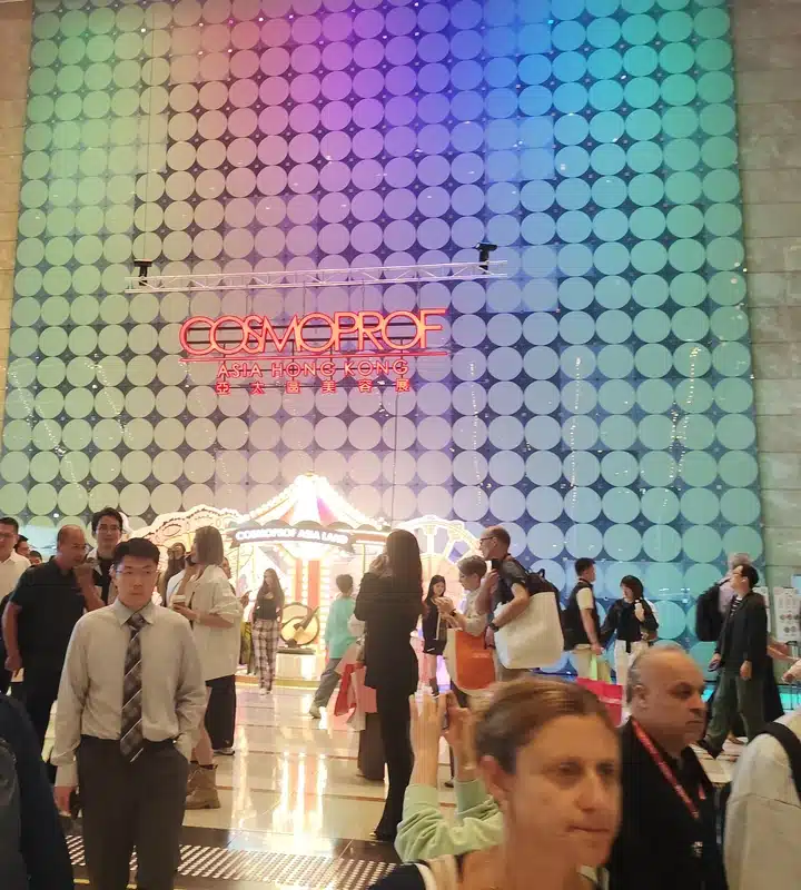
At a beauty trade show, you can look at dozens of colors in a few minutes. What takes longer is deciding which of those colors belong together, which ones would add something to your current catalog, and which are simply memorable under the show lights. That's the part of the visit we wanted to bring back to our work at JTING.
We visited Cosmoprof Asia 2026 at the Hong Kong Convention and Exhibition Centre in Wan Chai to see how professional beauty products were being presented. We attended as visitors, not exhibitors. These field notes reflect what we saw during our visit. The JTING collections featured later are from our own catalog, not from the show floor.
Why JTING Visited Cosmoprof Asia 2026
For a gel nail polish manufacturer, a visit to a beauty fair is a chance to step away from a catalog and see how products are encountered in person. A row of similar bottles might look orderly from the aisle, but the buyer standing in front of it still needs to know which shade is which, what the finish looks like and whether the assortment answers a need in their business.
The 29th edition gives those questions a wider setting. The official 2026 show schedule lists Cosmoprof Asia at the Hong Kong Convention and Exhibition Centre from November 11 to 13, with finished beauty products including nails and accessories. The schedule lists the companion Cosmopack Asia event separately, for November 10 to 12 at AsiaWorld-Expo, with a focus on packaging, ingredients and contract manufacturing.
At the convention centre, we focused on how professional nail ranges were presented: the shades on display, the finishes shown on the nail and the way each collection was introduced.
On the show floor, we looked at how quickly a buyer could read a range. Could you tell what tied the colors together? Did the display show what the effect looked like on the nail? Those two questions connect directly to the shade cards, product photography and catalog pages a brand or distributor uses after launch.
What We Saw on the Show Floor

Color Families Made the Range Easier to Scan
One nail display showed bottle designs arranged in rows by color, with blues grouped together and pinks and other tones given their own rows. The grouping made it possible to read the range from the aisle before looking at individual products. You could tell that each row had a visual relationship even without knowing the shade names.
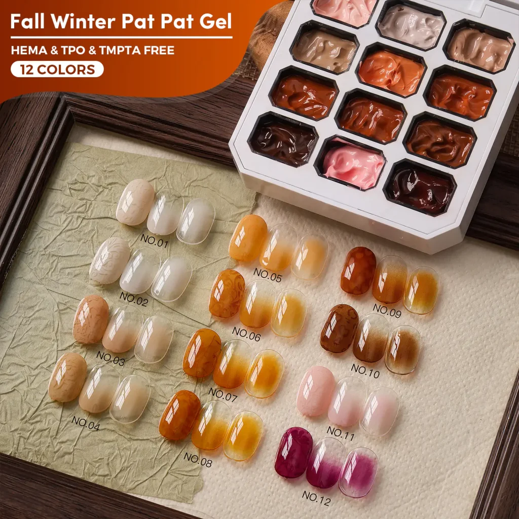
The rows of bottle graphics made the color families visible at a glance. A numbered swatch chart takes that idea one step further: once a buyer finds the right family, they can compare nearby shades and identify the exact one they want. That is the connection to the Macaron Gel chart below: the grouping helps buyers browse, while the numbers give them a shared reference for a sample or order.
Finished Looks Added Context to the Color
At the same stand, enlarged nail images sat alongside bottle graphics. The two displays answered different questions. Bottles conveyed the look of the range as a branded object, while nail images gave visitors a closer view of the effect. A swatch or a close-up can show a finish that is hard to read from the bottle alone.
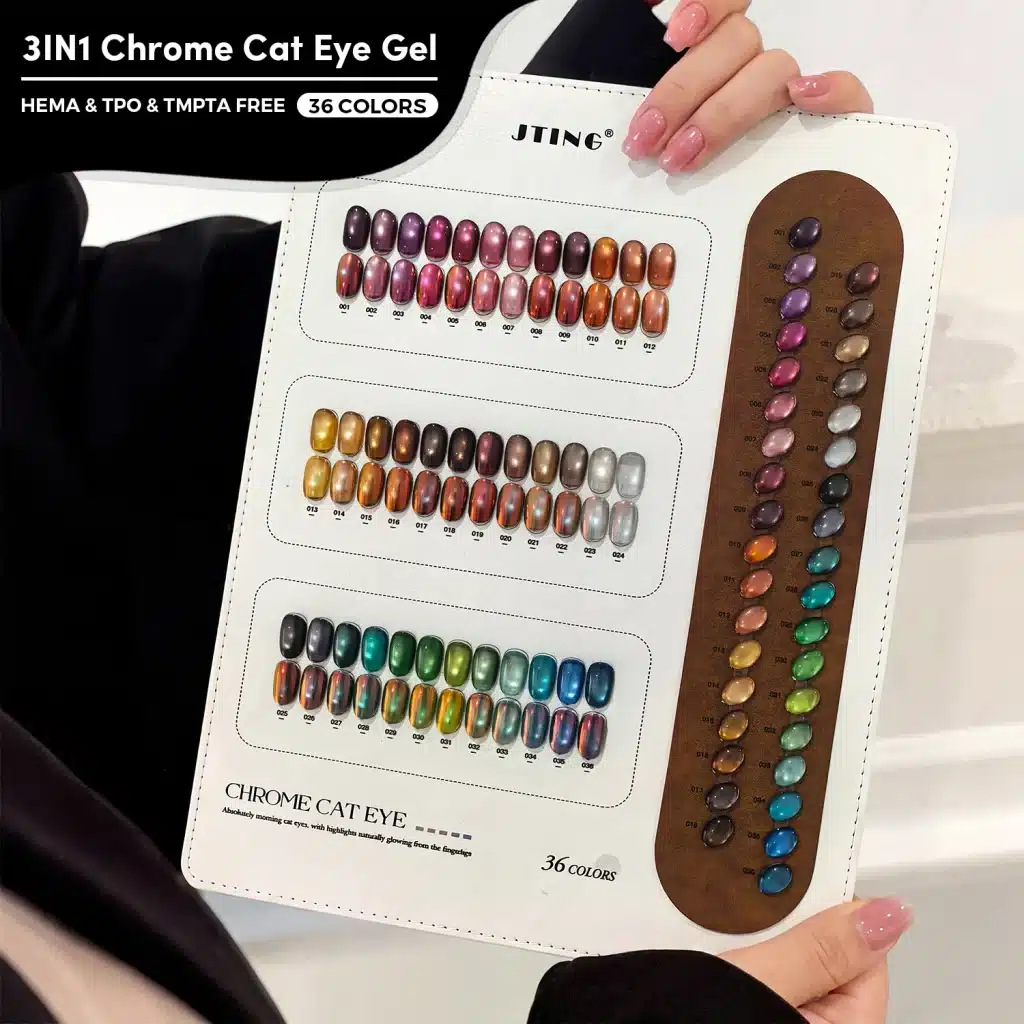
The enlarged nail images and the physical swatches answered different questions. A swatch board lets a buyer compare several shades in the same view; a close-up shows where the light catches on one nail. A still image cannot show how the highlight moves as the angle changes. That distinction matters for JTING’s Chrome Cat Eye Top Coat below: use the chart to compare colors and a close-up or short clip to show the magnetic effect.
Product and Manufacturing Messages Shared the Same Space
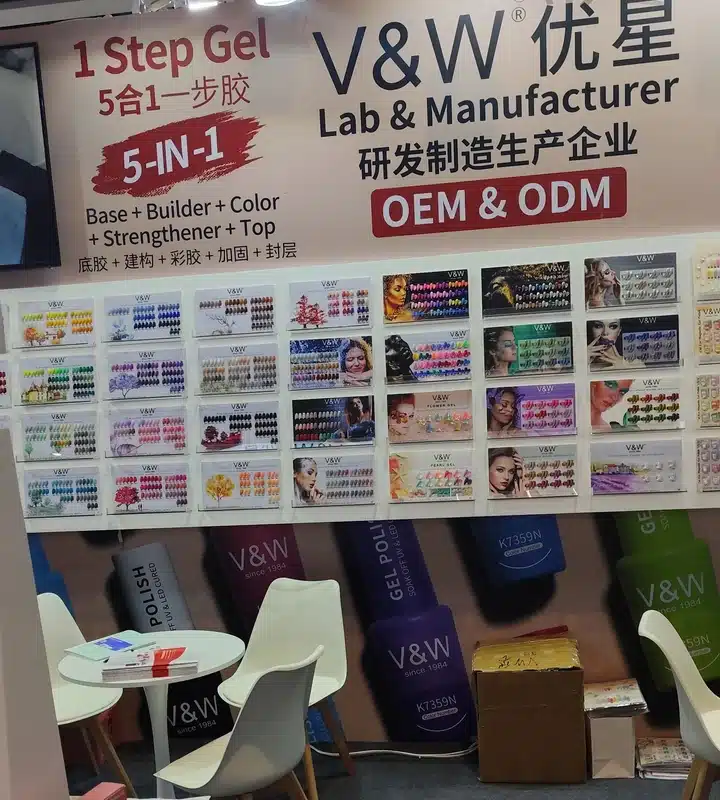
At another nail stand, rows of physical shade cards sat under OEM and ODM signage. That placement spoke to two audiences at once. A buyer looking for an existing range could start with the swatches; a brand exploring its own line could also see that the conversation might extend to manufacturing and packaging.
The swatch cards gave buyers something specific to point to before the conversation turned to private label. That is a useful order for our own collections, too: show the finish and identify the shade first, then show how the bottle, label and packaging can carry that collection under the buyer’s brand.
What Makes a Gel Polish Collection Work
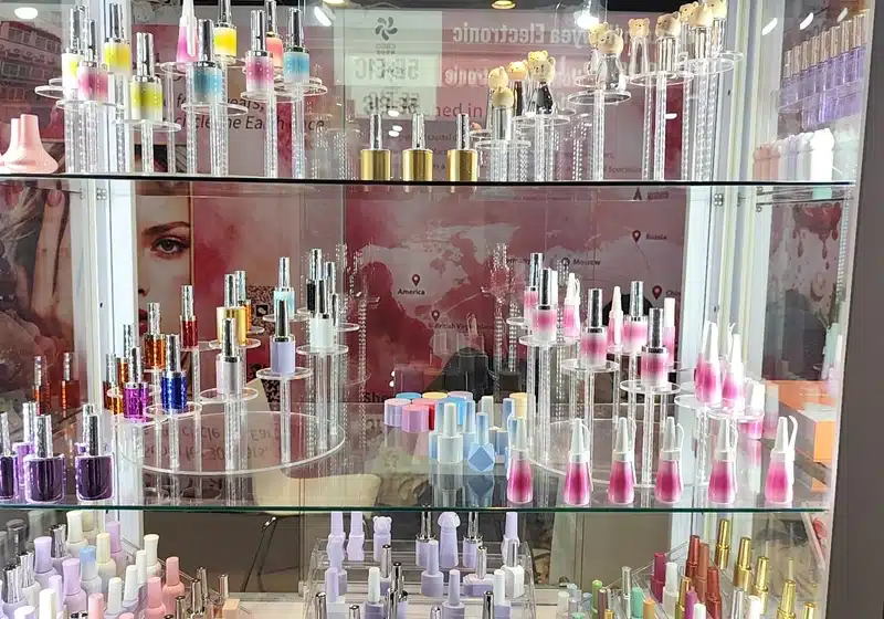
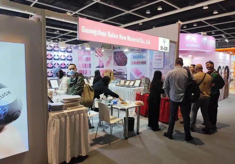
Two other displays showed what the bottle and the swatch each do well. One used glass shelves to bring bottle shapes and cap finishes into view. Another combined large nail images on the wall with samples on the table. For a brand, the bottle makes the range recognizable at a distance; the swatch is what lets a buyer compare shades up close.
A useful range has an obvious starting point. For a salon distributor, that might be a group of shades that customers can reach for across different appointments. For a brand, it might be a recognizable color story that still works when individual shades are photographed or sold on their own. In both cases, the customer should be able to tell what ties the collection together.
Start by giving each shade a reason to be there. Two nearly identical pinks may make sense if one is sheer and the other offers a different look on the nail. If the difference disappears on a swatch or in the customer's own photography, both shades may be competing for the same place in the range. A stronger assortment uses the space for a color or finish with a clearer role.
The same applies when mixing categories. Solid colors give the range a foundation. An effect collection adds something visually distinctive. A builder gel group can extend the catalog into a service category, rather than simply adding more shades to the color menu. These are three different reasons to carry a product, and the distinction makes the range easier to buy.
Imagine a salon supplier with a well-established neutral selection. Adding another full spectrum of solid colors might duplicate much of the existing catalog. A compact magnetic collection, by contrast, could offer a different finish while sharing the same color mood. The new products then have a reason to sit next to the existing line rather than replacing it.
A collection also has to survive beyond its first photograph. Consistent shade references and a clear way to group products help the sales team present it, help customers find favorites again and make the next seasonal addition easier to explain. A coherent collection is not necessarily a large one; it is one that people can understand and use.
JTING Gel Nail Polish Collections for Brands and Distributors
Here is how those ideas translate into three product categories from JTING. Each does a different job in a professional catalog: build the main color range, introduce a distinct visual effect or add products for structure-focused services.
Gel Polish Color Sets for a Core Collection
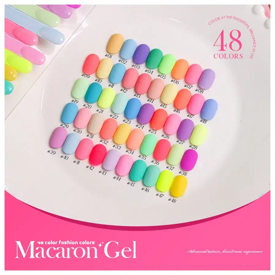
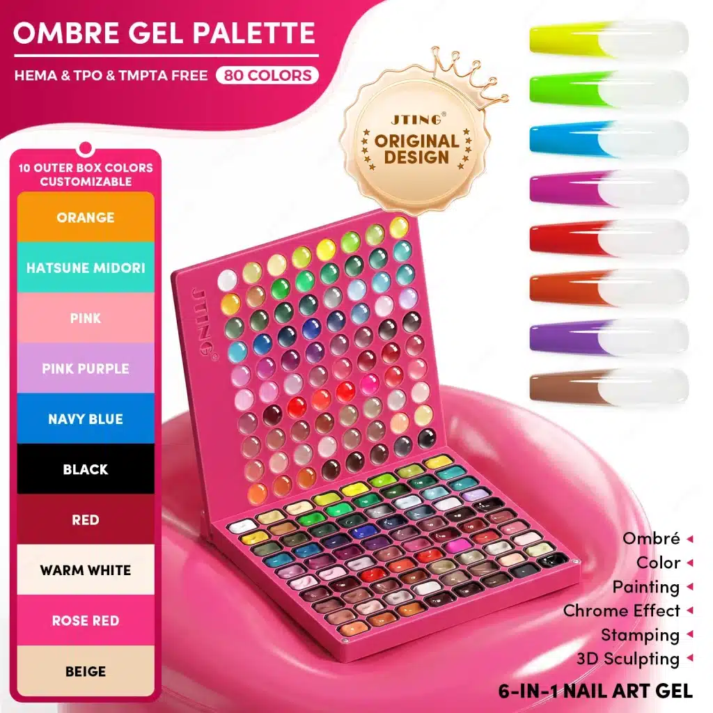
JTING’s 48-color Macaron Gel palette combines soft blues, lilacs and pinks with brighter coral, yellow and green. The numbered swatches make the range easy to browse and give each shade its own reference. It is one example from our gel polish color sets for brands and professional distributors.
A pastel assortment, for example, can be built around related levels of lightness while still giving each shade a recognizable hue. The result reads as one collection without turning the individual colors into near duplicates. For a brand, that visual relationship can carry through to a shade card and a set of launch photographs. For a salon supplier, the same structure makes it easier to explain what the set adds to an existing menu.
Think about the difference between a set customers order as a group and shades they later want to find individually. A collection can have one visual identity while each color retains its own name or number. That becomes useful when a salon wants to identify one shade from a display, or when a distributor needs to tell two similar tones apart in its catalog.
JTING develops custom gel colors and coordinated shade collections, and provides color charts for presenting them. Buyers building a house range can use an existing collection as a starting point; brands working on their own look can build a palette around the tones they want customers to recognize.
Cat Eye Gel Polish for a Distinctive Effect Range
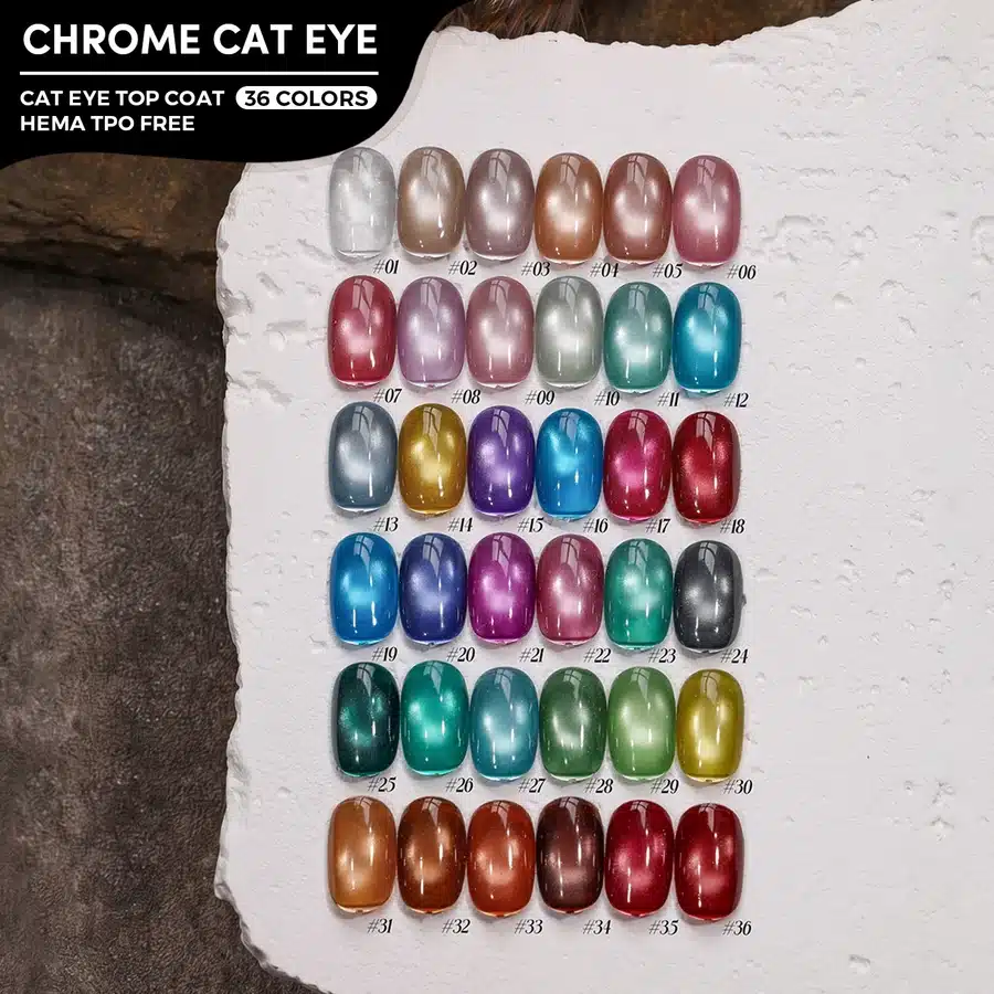
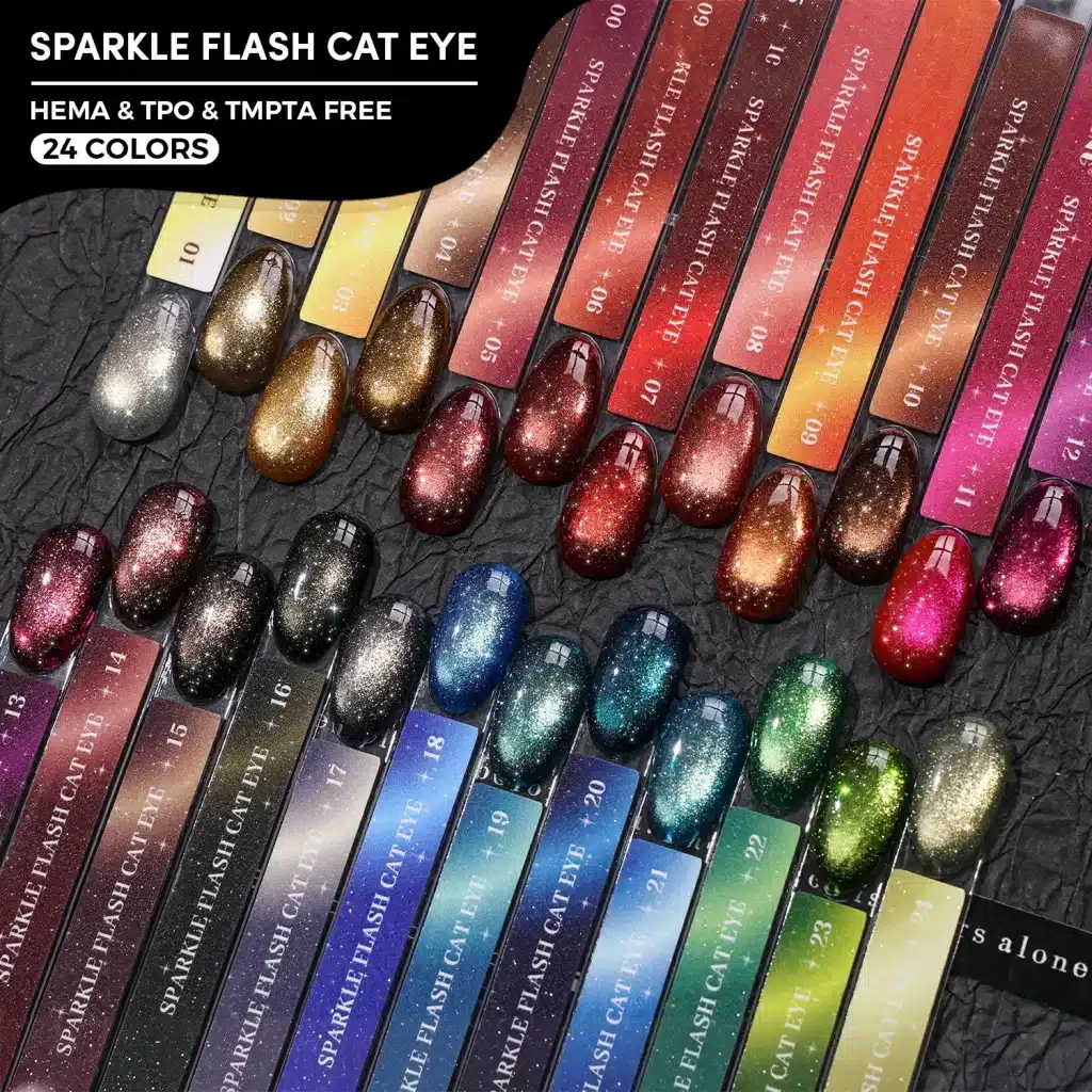
JTING’s 36-color Chrome Cat Eye Top Coat range spans pale silver, muted rose, teal, deep blue and copper. Its magnetic highlight shifts as the viewing angle changes, giving a collection a finish that stands apart from solid color. This is a top coat example within JTING’s broader cat eye gel polish category.
One direction is to keep the shade family familiar and let the effect supply the difference. A brand built around muted tones might add a small magnetic group that fits the same palette. Another direction is to give the magnetic collection its own color story, with deliberate contrast between the shades. Both can work. The choice comes down to whether you want an extension of the core range or a separate feature collection.
A distributor also needs a practical way to show why the shades are different. A chart that places related samples next to one another is useful for comparison. A closer product image or short clip can show the movement of the highlight as the angle changes. Pairing those two views gives a buyer more information than a single dramatic picture of the brightest shade.
Consider the comparison a sales representative would make with a salon customer. If both samples are in the same color family, the representative should be able to point to a visible difference in the finished look, not just two different names. A group that moves from softer to more pronounced effects can be easier to demonstrate than one organized around novelty names alone. The product story becomes the finish the customer can see, backed by a shade reference they can order from.
Builder Gel for a Service-Led Assortment
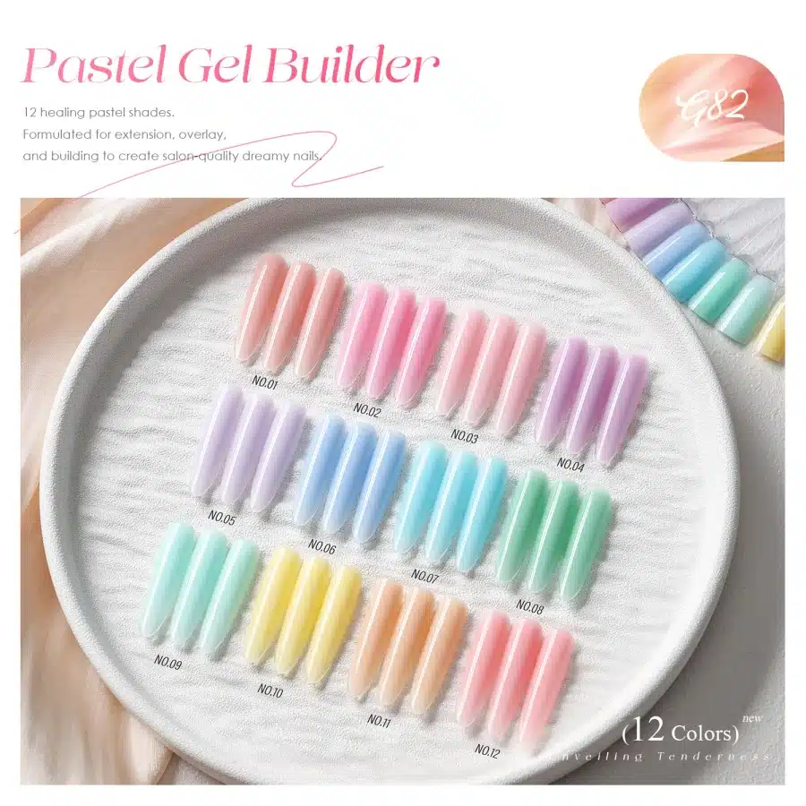
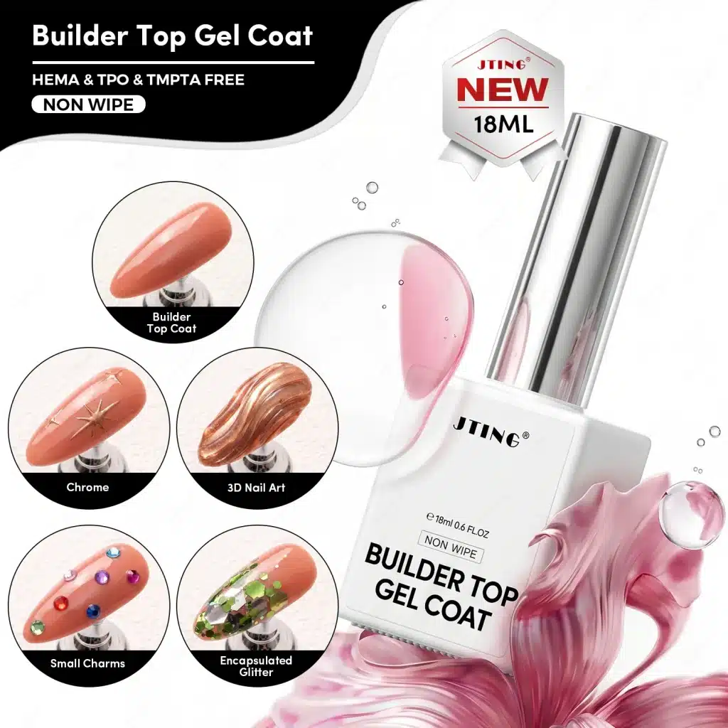
JTING’s 12-shade Pastel Gel Builder palette includes soft pink, lilac, blue, mint and peach. It gives salon distributors a colored alternative to neutral builder shades while adding a product for structure-focused nail services. Explore the full builder gel range by format and intended use.
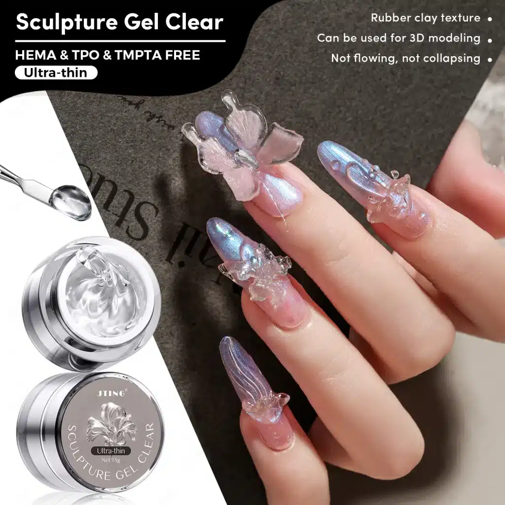
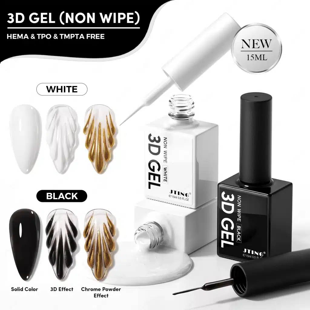
JTING's builder range includes conventional builder gels, bottle builder gels and file-off hard gel options. Those formats should be presented distinctly. A customer looking for a bottle format for an overlay service is not necessarily shopping for the same product as a technician looking for a file-off hard gel. Organizing the catalog by service first gives the buyer a meaningful way into the category.
For a salon supplier, that separation can keep a new range concise: choose the builder formats that fill a service gap, then select the shades that fit those formats. List application, curing and removal information for the specific product so the salon can distinguish between options without having to infer their use from a shade chart.
Two Ways to Build Your Next Assortment
A first launch needs a recognizable palette. An established catalog usually needs a more targeted addition.
- New Nail Brand
- Build the first release around one coherent color family or a balanced group of core shades, then add a smaller cat eye collection that shares its visual identity.
- Established Distributor
- Keep the familiar core range and fill one identifiable gap: a distinct magnetic finish or a builder category for salon customers.
For a new brand, suppose the starting point is a soft-color collection. Choose enough variation for the shades to be distinguishable on a chart, without asking customers to learn several unrelated palettes at once. A complementary cat eye group can stay within the same visual mood while giving the launch a second finish. The brand can photograph both together and still make the distinction between a regular color and a magnetic effect clear in product listings.
From there, decide how the buyer will encounter the range. If the first point of contact is a line sheet, a clear shade map may do more work than a large campaign image. If the range is primarily presented in salons, a physical chart can make the difference between neighboring colors easier to see. The same products can serve both channels, but the materials should answer the questions people ask in each setting.
For an established distributor, the better question is often what the current range does not do. If accounts already have plenty of solid colors but few magnetic options, the gap is an effect, not another broad shade launch. If salons are asking for products for structure-focused work, a builder selection organized by service may add more value than another decorative line. Existing order history and account feedback are better guides to stock depth than how prominent a product looked at a fair.
Once you choose a direction, mark which products are intended for the regular catalog and which are there to test a new idea. That simple division makes the opening assortment easier to discuss, gives the sales team a clear message and leaves room to expand the range without rebuilding it.
For either route, an assortment sheet can be as simple as four columns: product family, shade or finish, role in the range and the channel where it will be offered. In a launch assortment, the role might be a core shade or a feature finish. In an established range, it might be a replacement, a missing option or a new service category. The sheet is useful precisely because it forces the proposed products into the same view as the ones you already carry.
Develop Your Next Collection With JTING
JTING develops coordinated gel nail polish colors and provides color charts, bottles, caps, brushes, labels and packaging for private label projects. A brand can carry its palette through to the packaging and product photography, while a wholesale buyer can begin with the product categories that complement an existing catalog. The starting points are different, but both benefit from a clear idea of what each product is there to do.
Discuss your next collection with JTING. Tell us which shades, finishes or salon services your range should cover, and we can start with the products and packaging that fit that plan.