JTING 4-Color 3D Metal Painting Gel introduces a compact metallic nail art palette for raised sculpted details and fine painted accents. For nail brands, distributors and salon suppliers, the opportunity starts with choosing how those two applications fit an existing professional range: a dedicated art product, a companion to familiar base colors, or a collection supported by demonstrations that customers can repeat.
The buying decision involves more than selecting four attractive tones. A metallic petal, a narrow French edge and a fabric-inspired texture need different sample demonstrations, even when they use the same gel. Compare the shades over the backgrounds your customers use, inspect the finished designs from the front and side, and assess the working method with the tools and curing system intended for your channel.
From those application choices, build a clear launch proposal: approved effect samples, accurate sales images, customer instructions, a defined supply configuration and, where required, branded labels or outer packaging. This guide connects those decisions with sample approval, quotation comparison and reorder planning, helping your team evaluate the product and present it to professional customers with a clear explanation of what the palette supplies.
01. Introducing JTING 3D Metal Painting Gel
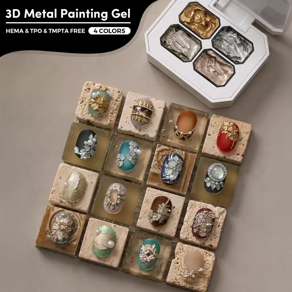
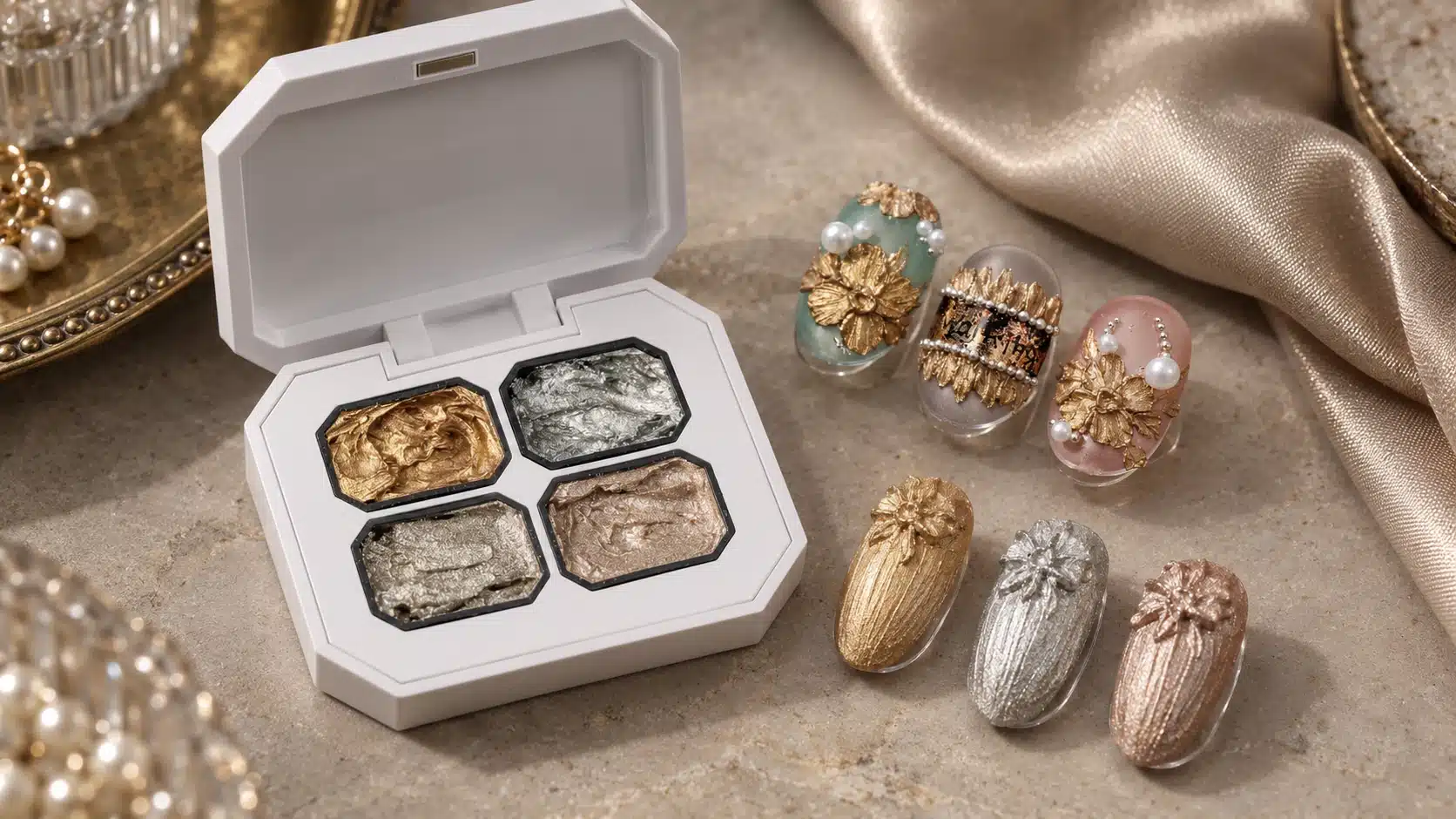
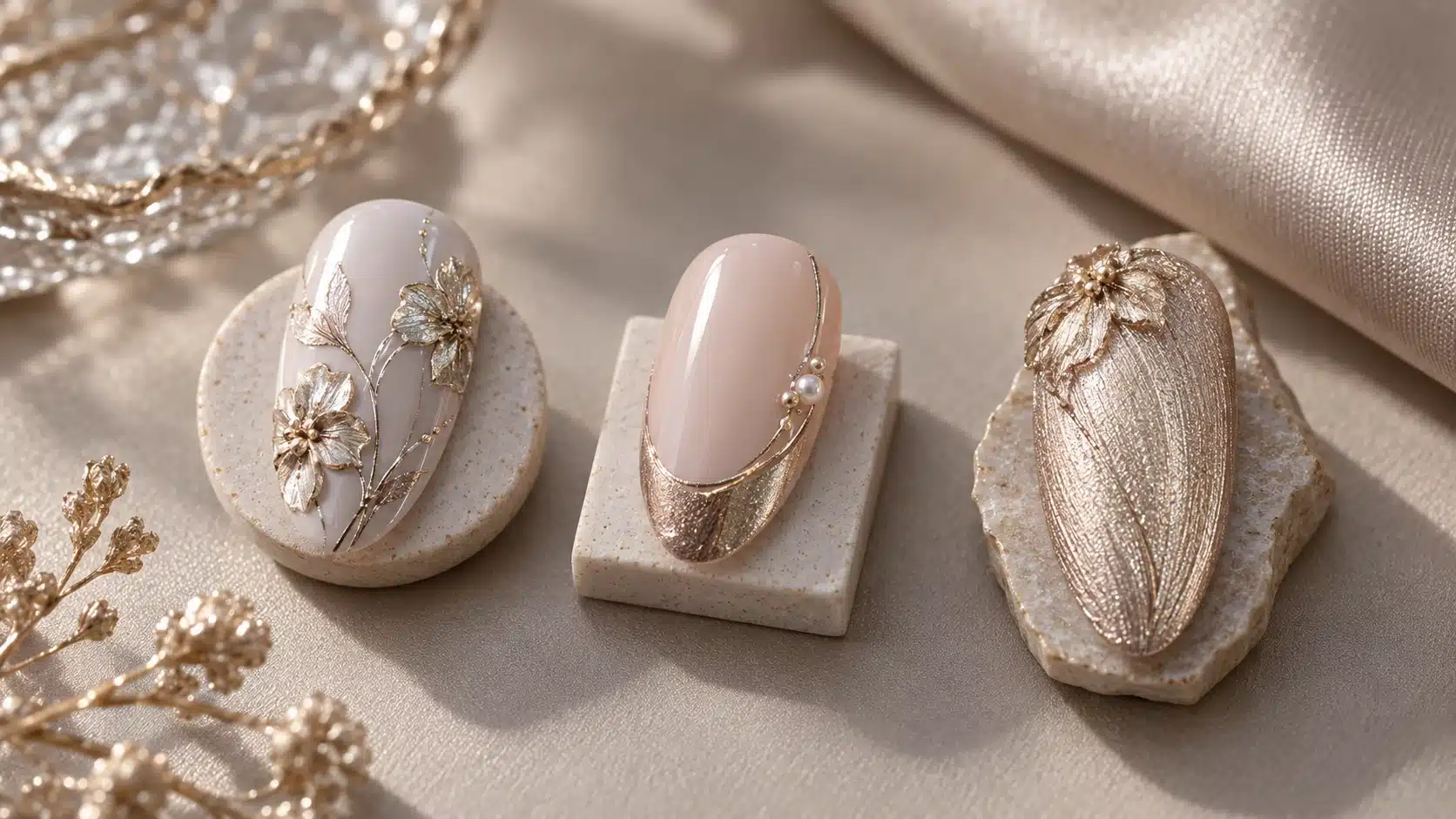
A metallic accent can be drawn as a fine line or shaped into a raised petal. JTING introduces its 4-Color 3D Metal Painting Gel, model N12, for both kinds of decorative nail art. The thick, shapeable gel stays where it is placed while a technician works the surface into flowers, leaves, bows or wave-like relief. Pick up a smaller amount for outlines, metallic French edges and fabric-inspired details. The reflective finish comes from the gel itself; creating the metallic surface does not require a separate powder step.
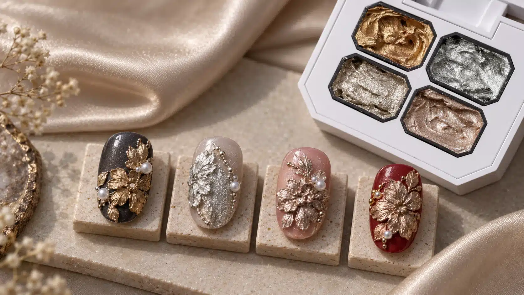
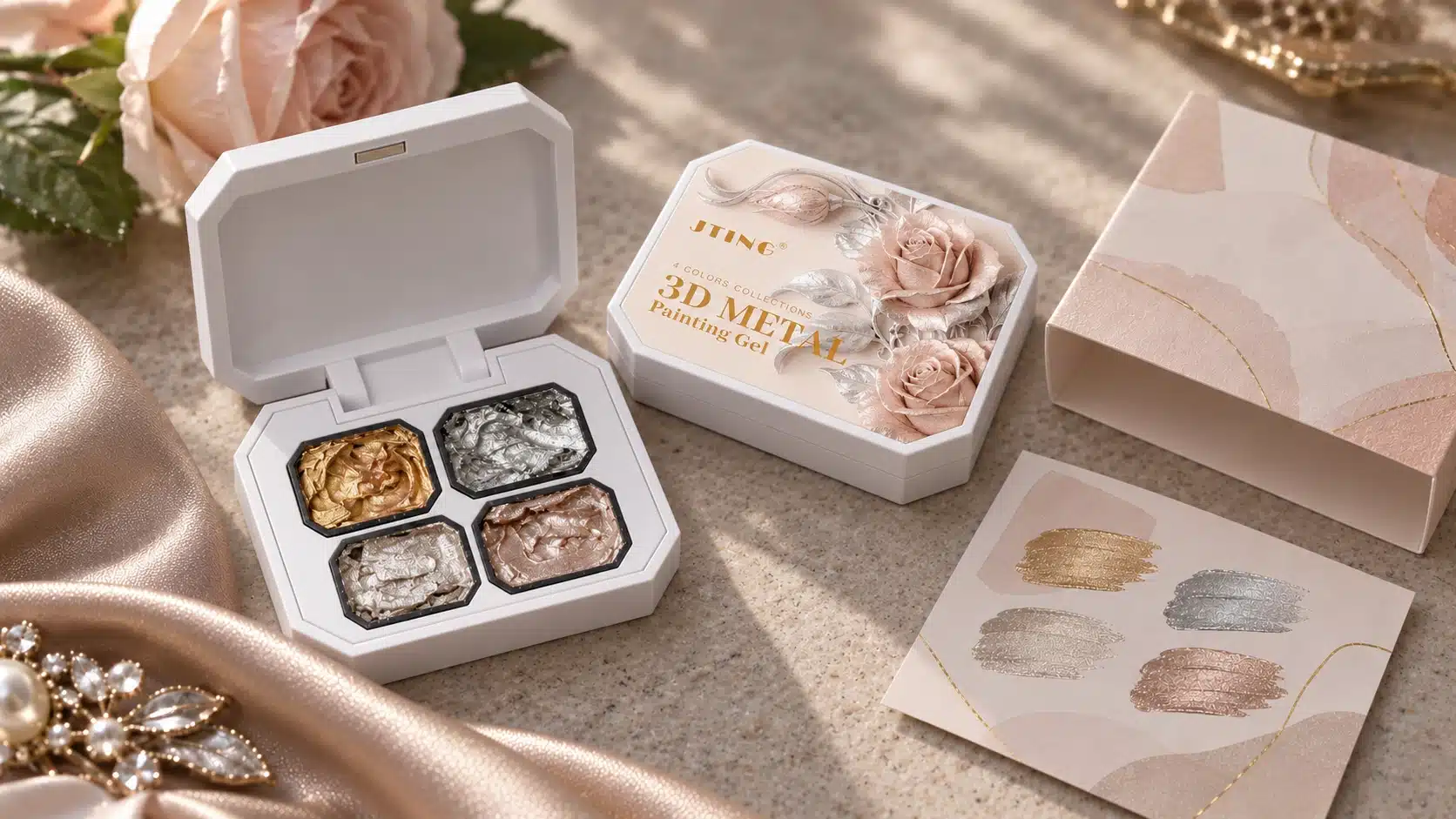
The product is supplied as a compact, white flip-lid palette measuring 63 × 50 mm across its face. Four separate wells, held within a black clipped-corner surround, each contain 3 g. Shade 01 reads as gold, Shade 02 as silver-white, Shade 03 as an antique-style metallic tone and Shade 04 as a softer rose-gold/champagne direction. The Shade 01–04 references make color comparisons clear across physical samples, catalogs and training materials.
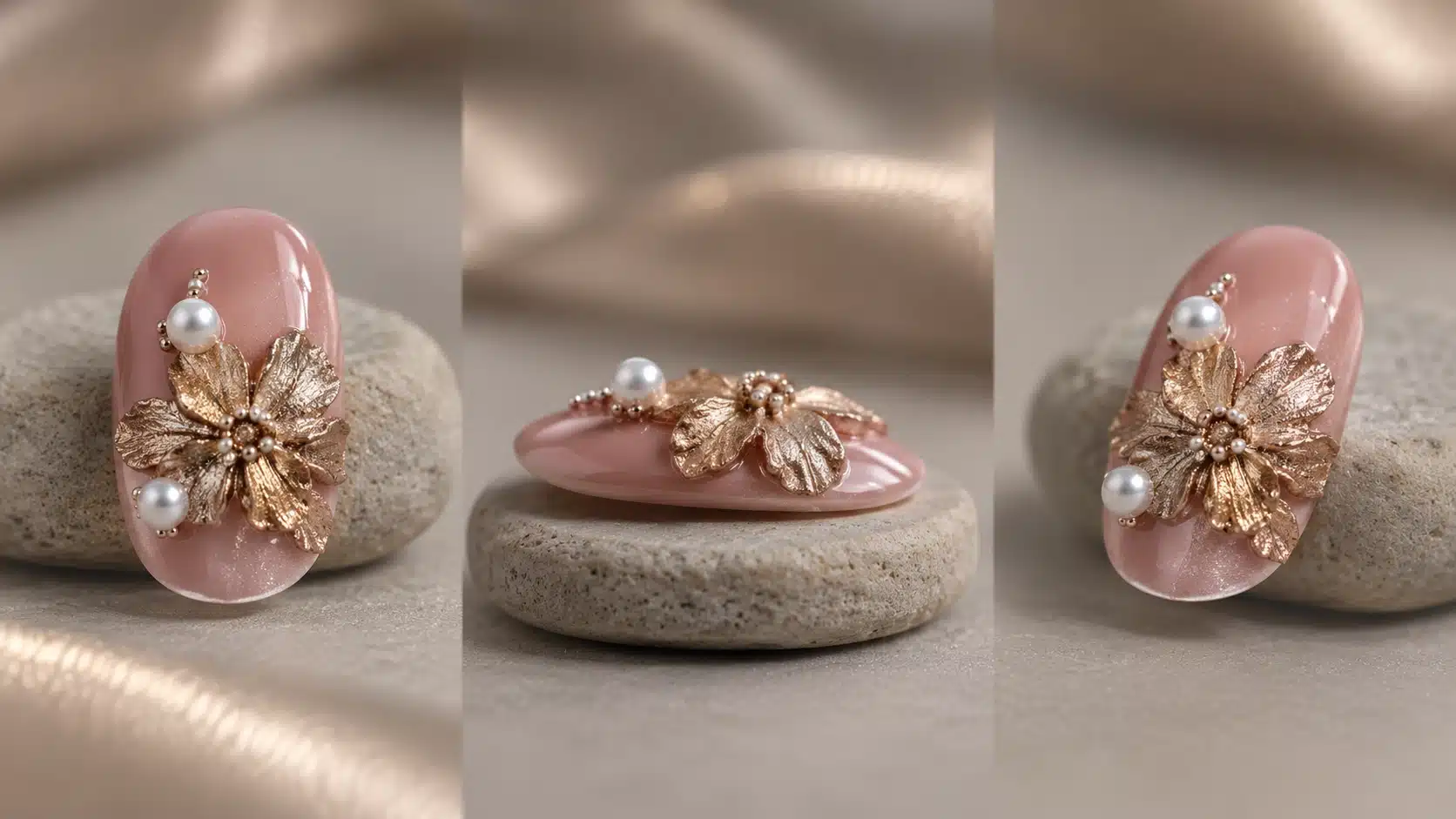
After the metal gel is cured, its surface is no-wipe and needs no additional top coat over the metal gel. The background still needs its own preparation and curing, and any separate ornaments need the finishing method appropriate to those materials. A raised flower with a pearl, for example, combines a gel-formed shape with an independently applied decoration. Showing that distinction is useful in a catalog and in salon training.
For a nail brand, this palette may add a focused metallic art product to an existing gel nail polish collection. A distributor can present one product through both relief and linework samples. A salon supplier can use the same comparison to decide which techniques its customers want to learn. Each buyer still needs to inspect actual color and handling with its own tools, bases and lamp before approving an order.
See the JTING 4-Color 3D Metal Painting Gel product page for the palette format, then compare shades and techniques to choose the designs you want to sample. A useful sample request names the metallic shade, background color and intended relief or painting application.
02. Define the Role of Metallic Nail Art in Your Product Range
Begin with the service or purchasing problem you want this palette to solve. A customer who wants a full metallic nail color, a technician who wants a raised metal flower and a salon that needs a narrow French edge are asking for different results. This palette is suited to artwork that needs shaped relief, fine metallic painting, or both. Its value is easiest to explain beside the products customers already buy and the demonstration they would actually use.
If your current offer centers on gel nail polish colors, place this palette as a decorative companion. Choose a small group of familiar base colors and show how a gold petal, silver-white contour or rose-gold edge changes the finished look. The base remains a separate product and should be named on the sample card. This pairing makes the purchase more concrete than showing the open palette alone. It also reveals whether your existing colors give the metallic detail enough contrast for a customer to recognize the technique quickly.
If you already sell nail art painting gel, compare a flat painted motif with the same motif made in raised metal gel. A line can define the flower; a shaped petal can create its body. Let the technique, not a broad category label, establish what is new. Where a customer wants only fine marks, demonstrate the smaller pickup and the line quality rather than leading with the most elaborate sculpture. Where dimensional art drives the purchase, show the side profile as well as the front view.
A nail brand can make this a focused four-tone art direction within a larger collection. It might choose two signature looks, one built around relief and one around restrained linework, and use the same shade numbers across packaging, training and product images. Before committing to a branded version, the team should approve real sample colors and decide which visual promise its campaign can reliably show.
A distributor needs a different arrangement. Sales staff should be able to identify the supplied four-well palette, explain the two applications and point to a sample for each. Put a prepared tip, its background color and its technique next to the correct shade number. Ask accounts whether they already carry chrome effects, sculpting materials or detailed liners. Their answers help the distributor position the metallic gel within its current assortment.
A salon supplier can organize the range around teaching time and service demand. A simple French border may be easier to introduce in a short demonstration; a layered flower can support a longer class. Both require the technician to evaluate the gel with the intended brush, background and curing conditions. Show a finished nail, then let a technician repeat the key motion on a practice tip. This helps distinguish interest in the photograph from interest in the working method.
Build the launch around two clear examples, such as a raised floral accent and a fine metallic edge over an existing base color. Show the shade number, background and finished result for each. Ask prospective accounts which example fits their current services, which needs a demonstration and which they would request as a trial sample. Those answers help distinguish a suitable product-line addition from a design that attracts attention but has no clear place in the customer's offer.
03. Choose the Right Material for the Metallic Result You Want
“Metallic nail art” can refer to a full color, a surface effect or a shaped decoration. The material should follow the finished result. Use the comparison below to frame a buying discussion, then evaluate the actual instructions and results for every product in the intended system.
| Material Direction | Main Visual Job | What to Demonstrate | Question Before Selection |
|---|---|---|---|
| Metallic Base Color | Provides metallic color over a broad area. | Show coverage and finish on the intended nail. | Is the goal an all-over color or a localized detail? |
| Powder-Based Chrome System | Creates a metallic surface through its specified powder and underlying finish. | Show the complete system and its required steps. | Does the customer want that surface appearance and workflow? |
| Other Decorative 3D Gel | Builds shaped relief according to its particular color and finish. | Show profile, edge definition and any separate finishing materials. | Must the formed detail itself appear metallic? |
| JTING 3D Metal Painting Gel | Forms metallic relief and smaller painted details from the same four-color palette. | Pair a raised form with a fine-line sample in the same shade. | Does this combination fit the intended design and working method? |
When comparing 3D sculpting gel for nail art, examine how the material forms a recognizable petal, bow or leaf and whether the metallic finish comes from the gel itself or an added material. This metallic palette is designed for decorative relief and fine painting. Nail extension and structural building require products made for those services. A supplier can offer several material types while giving each a distinct application example and product description.
Ask the customer to bring the design they want to sell, not only a category name. A sample request for “metallic nails” becomes useful when it specifies full coverage, a sculpted accent or a precise drawn edge. The required materials and teaching time can then be compared against that particular result.
Keep the base color and lighting consistent, then show the results each material is meant to deliver: an all-over metallic surface, a raised metallic motif and a fine contour. Label the materials and steps beside each tip so buyers can compare the finished look and the work needed to create it. If two materials are being considered for the same specific design, prepare matching motifs before judging their appearance or application method.
The same principle applies to stock planning. A buyer serving detailed salon art may value a compact palette with several tones; a buyer mainly seeking one all-over chrome finish may prefer another system. A brand may carry both, with distinct names and imagery. Comparing specific jobs prevents a metallic nail art gel from being filed under a vague “shiny nails” label that leaves staff unable to guide a purchase.
For a wider view of decorative gel roles, see JTING’s 3D nail art gel guide. For this palette, the selection test remains simple: approve the actual metallic tone, the shape that can be made with your intended tools and the fine detail that your customers expect to see.
04. Compare Four Metallic Tones Across Bases, Textures and Viewing Angles
Four shades offer more than four isolated swatches. The visible result changes with the background, the shape of the gel and the viewing angle. Plan a comparison that separates those variables, then build finished looks only after you know what each shade contributes. Use physical samples for color approval; a screen image is useful for direction, while a reflective material needs to be seen in hand.
Read the Four Shades as Design Directions
Shade 01, the gold direction, can lead a warm composition: a single raised leaf on a brown or deep red background, or a narrow accent beside a neutral color. Shade 02, silver-white, offers a cooler contrast for charcoal, blue or clean nude designs. Shade 03 reads as an antique-style metallic tone and can support an aged or ornamental design direction. Shade 04 is softer, in a rose-gold/champagne range, and may suit a warm nude or pink setting where bright gold would dominate.
Label every physical tip Shade 01, 02, 03 or 04. If a collection theme later gives the designs names, keep those numbers in the approval record. This matters most for Shade 03: a photograph can make a reflective color appear grayer or warmer as the light moves. Match the design name to its numbered physical sample.
Hold the Technique Still While You Change the Base
Prepare a small, deliberate base set from colors you already intend to sell: one deep shade, one nude and one soft pink are a useful starting comparison. Place the same short stroke or petal shape in each metallic shade on each background. A dark base may sharpen an outline, while a near-tone base may create a quieter design; compare those effects on the actual cured tips. If your range is built around another background family, use that instead of copying a generic display palette.
Keep the base color code on each card. A warm gold against black and the same gold against a beige nude may attract different buyers, but the useful record is more specific: Shade 01, named base, named technique and a photograph of the actual tip. Avoid comparing one elaborate flower against one simple line and calling the difference a shade effect. Consistent artwork makes the color decision legible.
Compare Flat Marks with Raised Form
Next, keep the shade and background constant while changing the application. Make one thin outline and one small raised petal. The line test reveals whether the metallic edge stays clear at the width your technician normally works. The petal test reveals the contour, the point where it meets the base and whether its surface detail remains visible after curing. A thicker deposit can create a stronger profile, but adding volume without a clear edge may make the motif harder to read. Build the sample around the design you plan to teach or sell.
Texture changes the way highlights appear. Fine ridges in a fabric-inspired stroke, a smooth bow loop and a shaped leaf do not present the same surface to the light. Ask the same technician to make a repeatable version of each, using the intended tools. Record whether a shade is most useful as the main form, a small outline or an accent on a companion nail. That is a more actionable conclusion than declaring one shade “best” from a single hero image.
Inspect the Front, Side and Moving Highlight
View each tip from directly above to judge placement and overall color. Lower the viewpoint to inspect the petal edge or bow profile. Then rotate the tip slowly to see where the metallic highlight travels and whether the shape remains understandable when the highlight leaves its center. A front-facing photograph may show a striking reflection while hiding an uneven edge; a side view may show height while concealing the color balance. Keep both views.
Use steady lighting and a consistent background for the first comparison photographs. Add a short rotation clip for shades and raised forms that change strongly with angle. Keep the physical approved tip, since screens, white balance and compression can alter a metallic appearance. Note which view makes the shape and color easiest to judge.
For each selected look, retain a cured tip with its shade number, base color, tool and curing conditions. Photograph that same tip from the front and side. If you revise the design, keep the earlier tip until the replacement is approved. Buyers can then see what changed in color, contour or line definition, while sales staff have a physical reference for the design they are presenting.
Before final approval, place the selected tips in the display or catalog setting where customers will first encounter them. A subtle line that reads beautifully in a close photograph may need a different base or placement to remain legible in a shelf display.
05. Build a Design Collection Your Customers Can Understand
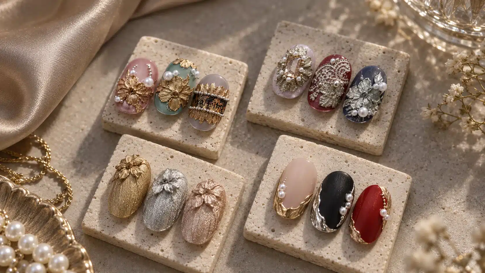
A display of unrelated nail tips can make a four-color palette look more complicated than it is. Arrange a small collection around design jobs that customers can name, compare and teach. The four directions below show distinct ways to present the palette; select the ones that fit your customers and their services.
Metallic Floral Relief
Make the raised motif the first thing a viewer sees. A single petal cluster or shaped leaf on a restrained background shows how the thick, shapeable texture supports dimensional art. Shade 01 can lead a warm botanical design; Shade 02 can set a cooler direction. Use a contrasting base and leave space around the motif so its outline and side profile remain visible. Show the shaping step before curing, then photograph the cured tip from above and from the side. Buyers can see both how the relief is formed and what a salon would present as the finished design.
Relief with Separate Ornaments
A raised bow or flower can be paired with a pearl, crystal or metal ornament. In the finished image, identify which part is sculpted from the metallic gel and which part is an added item. Use a simple base so that the buyer can distinguish the gel from the independent decoration. The working demonstration should also name the separate attachment and finishing method required by that accessory. On the sample card, list the embellishments separately from the four-well palette.
Fabric-Inspired Metallic Texture
Fine ridges or flowing marks can suggest woven fabric or satin without constructing a large raised flower. Try a modest metallic panel, a diagonal stroke or a narrow textured area on a deep or muted base. Shade 03 can be evaluated for a more antique direction; Shade 04 for a softer warm one. Keep the sample close enough for the texture to be visible and photograph it under controlled light. Training should focus on the point of brush contact and the rhythm of the stroke.
Minimal Metallic French and Outline
At the other end of the collection, use only a small amount of gel. A short silver-white border, a gold edge or a rose-gold contour can show the palette as a fine metallic painting product. Choose a clean base and keep the line width consistent across the demonstration tips. A salon supplier can use this look first when its customers are more familiar with linework than relief. The comparison becomes especially clear when the same shade appears as a thin border beside a raised petal on a second tip.
For each direction, prepare one lead tip, one close detail and one card naming the shade, base, technique and any independent materials. Pick the two looks that fit your buyers. A brand may select an ornate lead image and a quieter companion service; a distributor may put the minimal design first because it is easier to explain at the counter.
Identify the palette shade and separate base or ornament on every display card. A buyer should be able to point to a finished tip and know which material creates the metallic detail and which materials complete the design. For an embellished look, retain an unembellished companion tip so customers can compare the gel-formed relief with the version that includes additional decorations.
Keep the collection coherent through repeated shade numbers, a limited background family and a consistent demonstration format. A theme name can make the range memorable, but customers still need to identify which materials create the result. When artwork, sample card and supplied palette agree, a sales conversation can move from “I like this picture” to a specific request for the color and technique shown.
Within a coordinated design, a salon could use a raised flower on one accent nail and fine metallic contours on companion nails. Show that relationship in the display rather than treating every tip as an unrelated style. Buyers can then consider how the same shade serves an elaborate focal detail and a simpler accompanying design.
06. Create Raised Relief and Fine Metallic Painting with One Palette
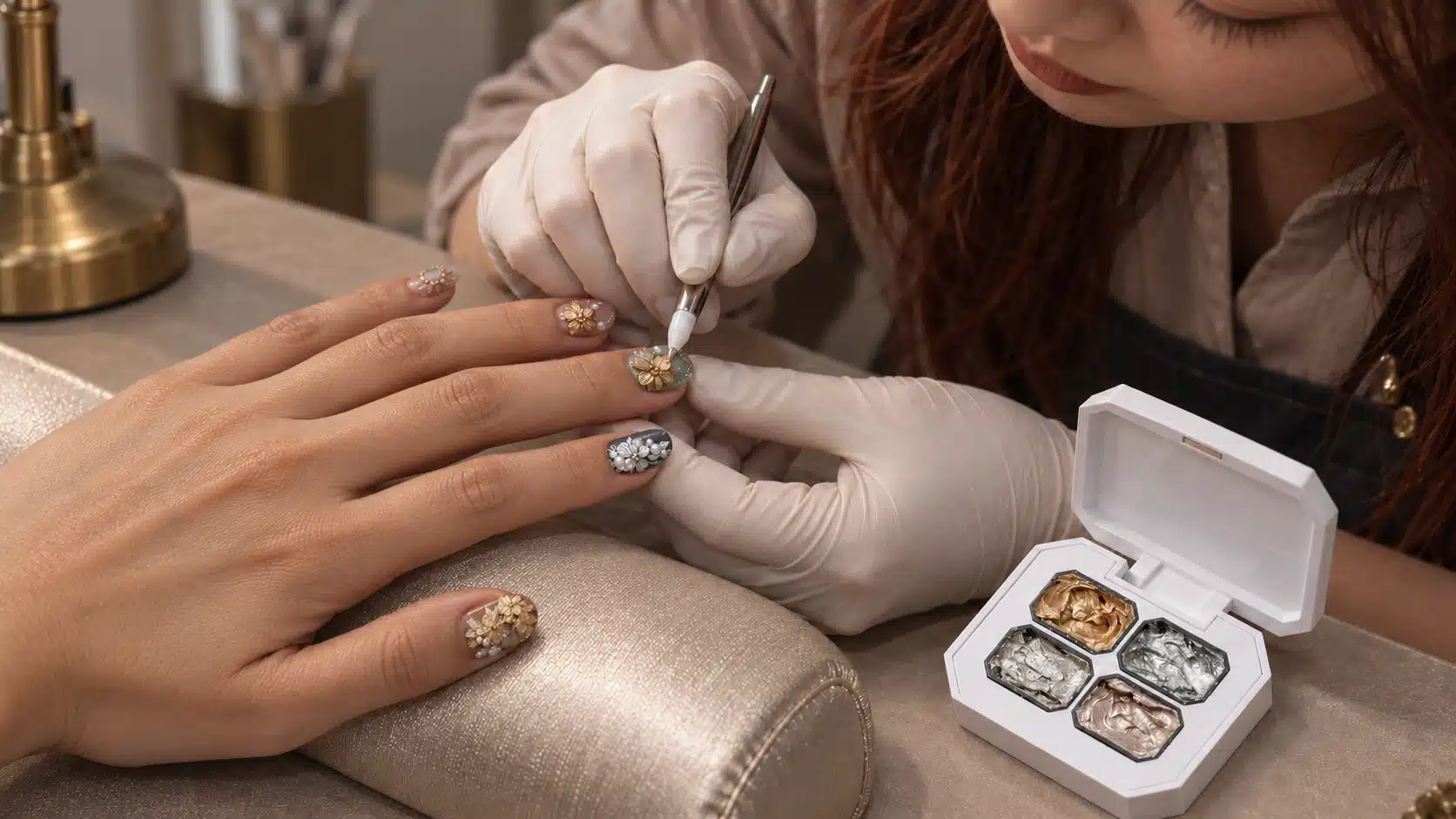
The most convincing demonstration uses one shade and one prepared base for two different pieces of work. Let the technician show a raised detail on one tip and a fine mark on another, then compare how the same metallic color behaves as form and as line. Use the intended tools and curing system throughout so the results can guide your own training.
Prepare the Working Area and Pick Up a Small Amount
Start with the intended nail preparation, cured base and cured background color. Keep the surface clean and even before placing the metal gel. Open the flip-lid palette and choose one of the four separate wells. Take up a small amount with a suitable art tool, close the palette after use and keep it away from unnecessary light and heat in storage. A small pickup gives the technician room to place and refine the first mark; more gel can be added where the design calls for fuller relief.
For a training video, show the palette, tool tip and prepared nail in the same sequence. Show the technician picking up gel from one well and placing it on the prepared nail. Identify the background product separately. This makes the product’s format and the role of each material clear before any decorative steps begin.
Shape Petals, Leaves, Bows and Wave-Like Relief
Place a small amount where the motif begins. For a petal, build from the center outward and draw the edge into the intended shape before curing. For a leaf, establish the outline, then use the tool to suggest a central vein or directional fold. A bow needs two readable loops and a center; a wave-like detail needs an intentional path and an edge that does not disappear into the base. Adjust the movement to the technician’s tool and the nail shape.
Add material in controlled stages if the motif needs greater height. Pause to check whether the design still has distinct edges and an identifiable center. A large mound may show volume, yet make the flower or bow harder to recognize. The thick, shapeable texture allows adjustments before curing, so use that working interval to refine the silhouette and remove an unwanted drag mark. Check the chosen height under your intended curing conditions.
Inspect the uncured form from above and slightly from the side. The top view reveals spacing between petals and the balance of the motif on the nail. The side view reveals whether the raised area has a clear contour and where it joins the background. Rotate the tip gently during the demonstration so the metallic highlight helps show shape instead of masking it. Once the form is satisfactory, cure it under the confirmed conditions for that sample.
Paint Fine Lines with Deliberate Tool Contact
Fine metallic painting begins with less material on the tool. Touch the point to the prepared surface, establish the starting position and draw the line at a steady pace. Keep the contact and direction visible in close footage. A shorter, controlled stroke may be easier to evaluate than one long decorative flourish. If a line widens unexpectedly, compare another trial with a smaller pickup while keeping the tool and prepared base the same. Inspect the cured start, curve and endpoint to judge whether the width suits the design.
Make several lines of the width your customers actually request, such as a petal outline, a nail-edge contour or a short accent. Look at the beginning and end of each line: a heavy deposit at either end can change the overall design even when the middle is clean. Test curves as well as straight marks if your planned designs include them. Use the same base and lighting as the raised sample so the team can compare application rather than camera treatment.
Organize French Edges and Textile-Inspired Marks
A metallic French sample should make the edge visible without leaving the viewer unsure where the color product ends and the art detail begins. Prepare the background first, mark the intended border and apply a controlled amount along it. Compare a continuous edge with a shorter accent variation. JTING’s French manicure gel guide offers broader context for presenting French designs; record the base, tool and line result for this palette’s sample.
For fabric-inspired texture, use the tool tip to create parallel or flowing marks that read as a deliberate surface pattern. Show a close view of the stroke direction, then a normal viewing distance to judge whether the texture remains recognizable. A satin-like impression depends on mark placement and moving highlights, so use a short rotation clip as well as a still photograph.
Turn the Demonstration into a Buying Sample
Present the relief tip and fine-line tip side by side with the same shade number and background. Add a third tip only if it answers a distinct question, such as how Shade 04 reads in a French edge compared with a rose-gold bow. Label any crystal, pearl or other accessory as separately applied. Let buyers handle or view real cured samples under ordinary and directed light, then gather comments on the intended service rather than a general “looks good” reaction.
Record the tool, pickup approach, base, motif, lamp and actual curing conditions used for the approved sample. A training team can then reproduce the demonstration sequence while an ordering team knows exactly which appearance was accepted. The same palette may serve sculpting and linework, but the two techniques should each earn approval on their own merits. Their needs are related, not identical.
07. Complete the Design with a Clear Curing and Finishing Method
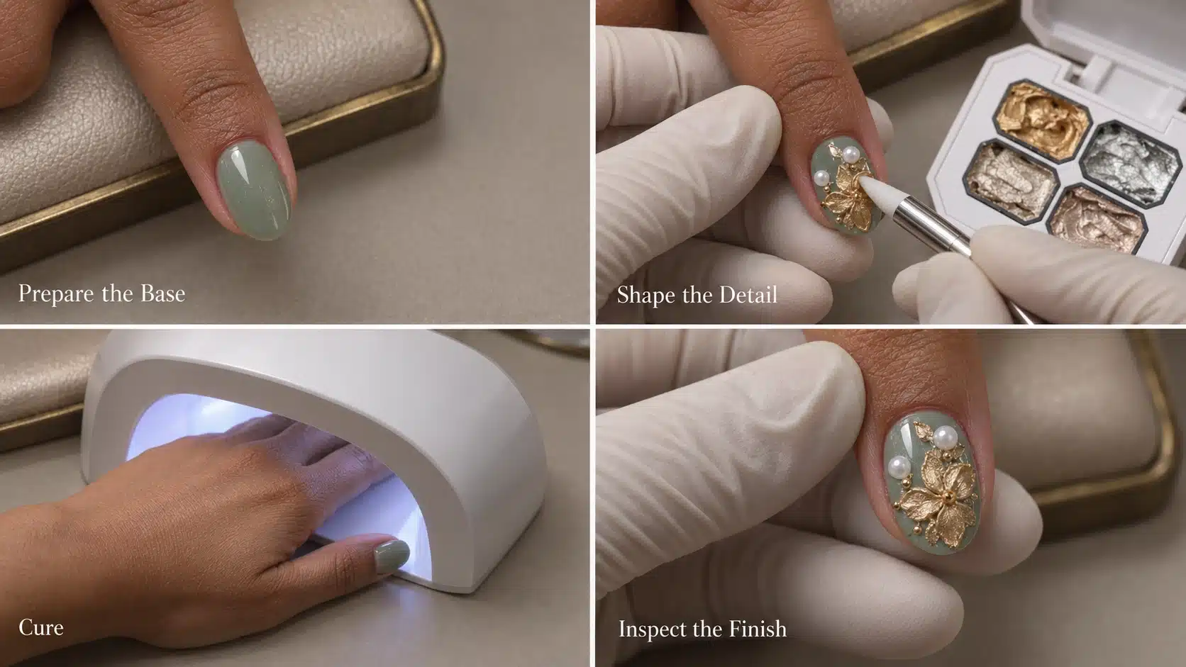
A convincing metallic design depends on the full working system, even though the gel supplies its own reflective finish. Start with the nail preparation and base gel specified for the service. Cure the base, apply the chosen background color and cure that according to its own instructions. Keep the background clean and even before adding the metal gel. This gives the shade and relief motif a consistent surface for comparison.
Place the metallic gel for either raised shaping or fine painting. Before curing, inspect the outline, ridge or petal from the front and side, and make any needed adjustments while the shape is still workable. For a repeatable training sample, note whether the technician used a single small pickup or added gel in stages.
The curing references for this metallic gel are LED 60 seconds and UV 120 seconds. Confirm the method with the actual lamp, art thickness and complete base system you intend to teach or supply. Lamp type, output and the amount of raised gel can differ between workstations, so record the conditions used for the approved design.
Once the metal gel has been cured under the confirmed conditions, its surface is no-wipe and needs no extra top coat over that gel. Follow the separate preparation and finishing instructions for the background color. If the design includes a pearl, crystal or metal ornament, use the attachment and finishing method specified for that separate material. Record those added materials on the sample card.
A short instruction card can follow four visible stages: prepared and cured background; placement and adjustment of the metal gel; curing under confirmed conditions; inspection of the finished metallic detail. Add separate notes for any accessory and its method. For a distributor or salon supplier, this sequence gives purchasing a clear list of conditions to repeat when approving the sample and later checking a demonstration made by another team.
Keep the cured sample beside its working record during training. If a second technician obtains a different line or petal, compare the base, pickup, tool contact and lamp conditions first. That gives the team a concrete route to repeat the approved design.
Before using a finished tip as a sales reference, inspect it under the same light used for the shade comparison. Check that the metallic area still reads as the intended line or raised motif, and photograph its front and side after curing. If an added ornament draws attention away from the gel, keep a second, unembellished tip beside it. Customers can then see the palette’s own finish and the optional completed design without confusing the materials.
08. Approve Metallic Appearance and Working Performance Together
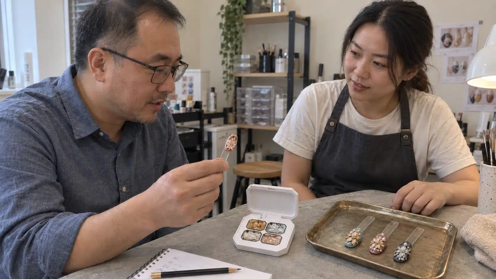
A sample approval for this palette needs to cover more than a photograph of four attractive colors. The same gel must serve as raised decoration and as controlled metallic painting, and its appearance changes with the background and viewing angle. Build a reference set that lets purchasing, product development and the team preparing customer demonstrations make the same decision. Keep the physical tips and the exact palette used for approval; written descriptions alone cannot preserve the shape of a petal edge or the way a metallic line catches light.
Set a Four-Shade Appearance Reference
Keep Shades 01–04 as the purchasing references throughout the trial, then match any brand shade names to the approved physical tips. Make a simple mark from each well over one chosen dark base and one lighter base used in your planned collection. If a nude or soft pink base matters to your buyers, include it as a separate comparison instead of assuming the dark-base result predicts it.
Use the same prepared tip type, base system, lighting and camera position for the first comparison. Label each tip with shade number, background and date. Look straight on for the overall color, from the side for the raised profile, and while rotating the tip for the highlights. A single high-glare image may make two shades appear closer than they look in person, or hide a rough edge. Record both what the physical sample shows and which photograph accurately represents it. Keep the approved images linked to the matching tips, so a later packaging mockup or sales chart cannot quietly become the only color reference.
Test the Two Applications Your Customers Will See
For relief work, choose a repeatable flower petal, leaf or bow detail. Note the tool used, where the gel was placed, whether it could be adjusted before cure, and how the edge looked after curing. Inspect the height and outline from the side as well as the top. The purchasing question is whether your intended demonstrator can make a shape that communicates the selected design, with visible boundaries and a metallic surface that suits the collection. Keep one approved example beside later trials and note where the contour differs.
For painting, use a small pickup to make a fine line, a short outline and one fabric-inspired texture. Make the tests on the same planned background as the relief sample. Record whether the line stays continuous at the scale you intend to show customers, where the tool must be reloaded, and whether the texture remains legible after curing. A large raised petal can look persuasive while a narrow line reveals a different handling question. Approving one application should not automatically approve the other. If a brand plans to promote only one technique at launch, it can still retain a reference for the second use and decide when its team is ready to demonstrate it.
Evaluate the Complete Working System
Prepare the background with the base coat and color system that your customer instructions will name. Cure those layers according to their own directions before applying the metallic gel. Record the actual tool, lamp, application size and layer condition used for each gel sample. Use LED 60 seconds and UV 120 seconds as reference times, then confirm the result with the selected lamp and the shapes your team will teach. Include both a dense raised detail and a thin line. Keep those conditions beside each approved tip so educators can repeat the evaluation.
Inspect the cured metallic surface itself. The gel has a no-wipe finish, and its cured metallic detail needs no additional top coat. The background system and separately added pearls, crystals or ornaments may have their own preparation and finishing methods. If your finished sample includes them, record the products and sequence so the complete design can be repeated. When a design is intended for wear, collect observations from trials under its actual conditions, including any changes in the appearance of the raised edge. Compare these observations with the original physical sample before deciding which designs to recommend.
Resolve Differences Before Signing Off
If a line looks thicker than the reference, first compare the pickup amount, tool contact, background and image magnification. If a petal loses definition, inspect the amount placed and the shape before cure, then compare the side view after cure. If a photograph looks warmer than the physical silver-white or antique-style sample, repeat it with consistent lighting and white balance before requesting a color change. Change one condition at a time and keep the earlier tip beside the new one. Otherwise, the team may mistake a different tool or camera setting for a different product.
Before approving the palette for a collection, identify the shade-and-base combinations and the relief and linework examples customers will see. Keep the physical tips, recorded application conditions and quoted configuration together. A later change to a shade, case or application claim can then be reviewed against the same approved reference.
| Decision | Reference to Retain | Action Before Approval |
|---|---|---|
| Shade and Base | Numbered 01–04 tips, base codes and comparison images. | Select the backgrounds and metallic tones for the launch. |
| Raised Relief | Petal or bow sample, tool and front/side views. | Approve the contour and demonstration method. |
| Fine Painting | Matched line, outline and texture samples. | Review continuity, turns and stroke endings. |
| Working System | Base, background, lamp and application conditions. | Confirm the curing method for the selected designs. |
| Supply Presentation | Palette, agreed contents, labels and packaging version. | Match the approved samples and artwork to the quotation. |
Decide which tested designs are ready for launch demonstrations, which need a customer trial and which require another comparison. Retain the tips and working conditions for designs you postpone. A brand can introduce a fine metallic edge first and add a more detailed relief technique when its samples and training are ready, while a salon supplier may choose the reverse sequence.
09. Prepare Product Images, Shade References and Demonstration Materials
A buyer should be able to distinguish the palette being supplied from the effects that can be made with it. Plan the sales set around three linked views: the closed and open palette, four clearly numbered gel references, and finished tips showing raised relief and fine painting. The white flip-lid case, black clipped-corner wells and four separate 3 g portions belong in the product views. Nail tips, tools and separate ornaments belong in the application views. Keeping those roles clear helps a distributor explain the offer without inviting customers to assume a decorated set, brush or crystal pack is included.
Make Shade References Useful Beyond One Campaign
Photograph each of Shades 01–04 in the open wells and on prepared tips. Keep the shade number beside its tip, even when the final design has a descriptive collection name. Where two backgrounds are used, show them as matched sets rather than mixing dark and nude tips in one unlabeled row. A useful sales sheet might pair a straight-on image with a slight-angle view and a one-line note such as “Shade 02 over a dark base, fine outline.” That note gives a buyer enough context to compare the pictured shade with a sample over their own base.
For raised designs, add a side view that shows the outline and profile. For lines or French edges, use a close image where the start, turn and end of the stroke remain visible. A short rotation clip can show how a metallic highlight moves as the tip turns. Use the same actual sample for the stills and video whenever possible. If an image is a concept rendering or an edited campaign composition, label it for its illustrative role and keep the approved physical sample as the source for shade and performance decisions. Caption a pearl-decorated design with the gel shade and separately applied pearl.
Give Every Demonstration One Job
A compact training library is more reusable than one long montage. One clip can show how a small pickup becomes a raised petal before cure; another can follow a narrow metallic line; a third can compare the same shade used for relief and painting on the same background. Include the product well, tool contact and finished result in each sequence. When curing is shown, identify the actual lamp and the conditions used for that sample, and carry the same information into the written demonstration notes. The LED 60-second and UV 120-second references still need confirmation under the selected application conditions.
Build versions for the places where buyers will encounter the product. A website page needs a clear first image, accurate palette specifications and a few short applications. A wholesale catalog needs a concise ordering reference and a distinction between standard product and optional branding. A sales representative needs the physical palette, a numbered shade chart and answers about what is included. A salon educator needs close views of the hand movement and the complete base-to-finish sequence. These versions can share the same approved samples while placing different details first.
Before distributing the files, compare captions with the actual supply configuration and the approved tip record. Keep Shade 03 linked to its numbered well, check that the softer champagne description points to Shade 04, and explain the no-extra-top-coat finish alongside the cured metallic detail. Keep the image file, caption and sample ID together. When a branded label or outer carton changes, update the product views and version date while retaining the approved effect references unless the gel itself has changed. That simple version discipline prevents an older mockup from being used as a current quotation image.
A buyer seeing the material for the first time should be able to answer three questions: Which four-well palette is being offered? Which shade made each finished design? Which tools or ornaments are separate? Put those answers in the image captions and ordering sheet. Clear product identification lets customers connect an attractive design image with the right sample or quotation request.
10. Help Your Sales Team Introduce the Collection to Customers
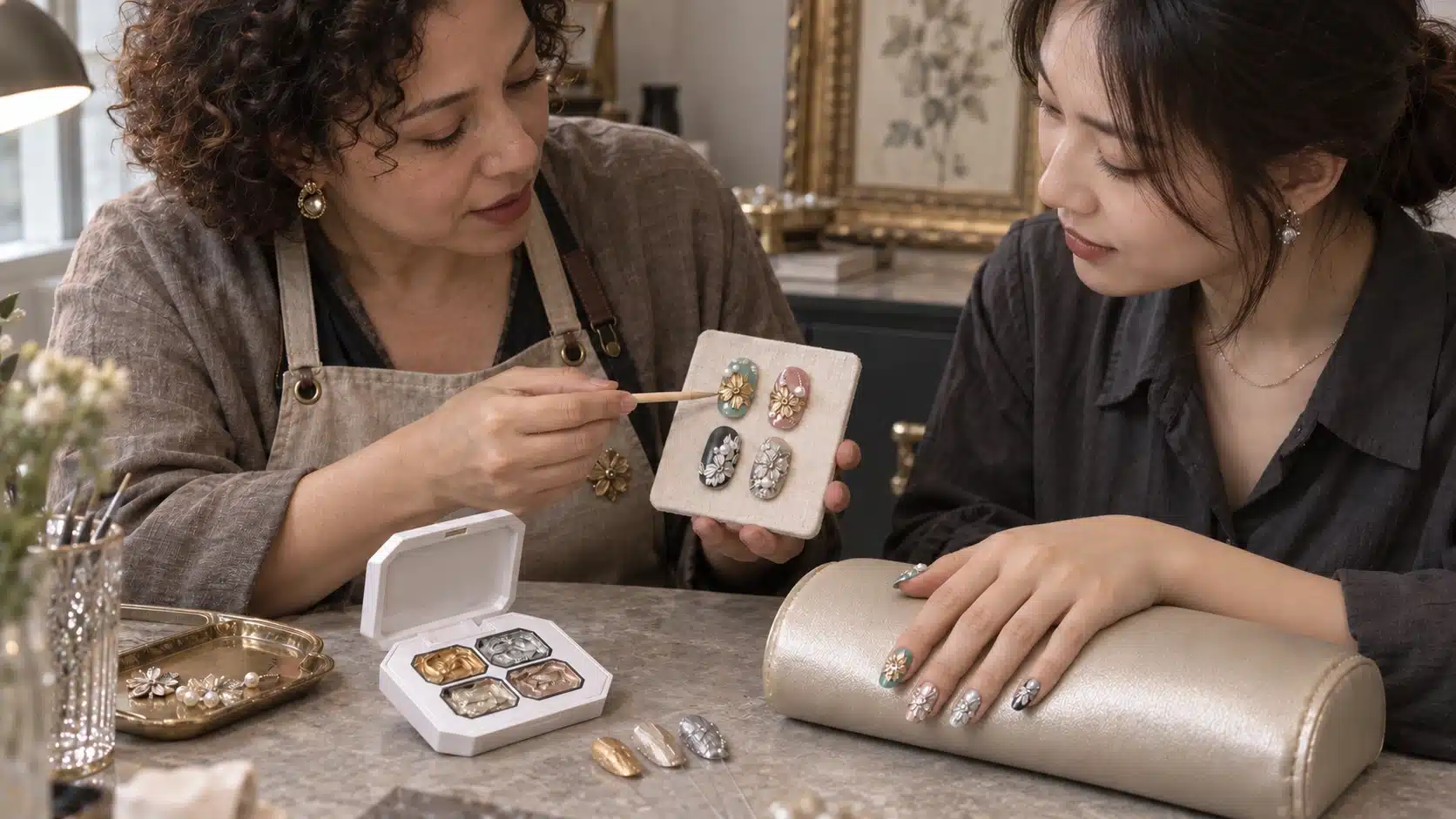
Open a customer conversation about this metallic nail art gel with the design task. Ask what metallic materials the customer already uses, whether technicians want raised details or small painted accents, and which background colors appear in the services or collections they currently sell. Then select a physical sample tip that answers that need. This gives the customer a specific reason to try the four-color palette and helps the salesperson choose the right demonstration.
Match the Demonstration to the Existing Routine
For a buyer who already sells a powder-based mirror system, show this gel as a different design route. Place the open palette next to a raised petal and a narrow painted outline. Explain that its metallic appearance comes from the gel itself after curing, while the powder system follows its own application method. Ask whether the customer is looking for continuous surface shine, localized raised art or both. The answer tells your team which sample matters and how the two methods might sit in the same assortment.
For a customer interested mainly in linework, begin with an actual fine-line tip and a close demonstration of small pickup and tool contact. Include an outline or a metallic French edge if it fits their existing designs. Show a raised sample afterward as a possible extension, not as the condition for using the palette. For a customer seeking dimensional decoration, reverse the sequence: start with a petal, leaf, bow or wave, view it from the side, then show how the same shade can add a related fine accent. Seeing both scales on one background makes the dual use concrete.
For a distributor, show the proposed palette configuration, the 01–04 shade map and two reproducible examples a sales representative can present across accounts. For a salon supplier, demonstrate the tool movement, cured relief profile and fine-line control an educator needs to teach. For a private label brand, show how the four shades fit the planned collection and which logo, label or outer-packaging elements need approval. Each channel receives the product information and samples most relevant to its purchasing decision.
Turn Trial Questions into Purchase Information
After a demonstration, ask the customer to try the selected use with their normal base, background and lamp. Capture the shade number, design attempted, tool and lamp used, what looked right, and the point where help was needed. “The line was hard to keep narrow on our pink base” is more actionable than “the texture was difficult.” The team can reproduce that combination, compare pickup and tool movement, and decide whether the sales guide needs a clearer example. Record questions about no-wipe finishing separately from questions about fixing a crystal or finishing the background.
After the trial, establish what the buyer still needs to decide: approval of the physical result, another sample under its own lamp and background, or confirmation of branding and supply. Match the next step to that question. A buyer who likes the relief but struggles with narrow lines needs a more focused application comparison; a buyer who has approved the technique may be ready to review packaging and a quotation. Keep the demonstrated tip and shade reference with the request so JTING can identify the product and effect being discussed.
If the account asks for single-shade replenishment, check the available supply arrangements with JTING before including that option in a proposal. Confirm who will evaluate the next sample or artwork and when that decision is expected. The follow-up can then address the remaining purchase question instead of repeating the whole launch presentation.
11. Compare Quotations and Plan the First Order
Before comparing prices, make sure every quotation describes the same unit. The product is a four-color flip-lid palette with four separate wells containing 3 g each. Confirm whether the quoted unit is one complete palette, what outer packing and marking it includes, and how palettes are packed for transport. Ask separately about any tools, pearls, crystals or other ornaments pictured in promotional designs. They are distinct materials and should only enter the comparison if their supply is specifically agreed. A price without its configuration cannot tell a buyer what will arrive.
Build One Comparable Quote Brief
Send JTING the intended destination and channel, the number of complete palettes, the approved sample reference, and whether the order uses the standard presentation or needs logo, label or outer-carton work. Request one quotation that identifies the supplied palette, packing unit, product-specific MOQ, sample arrangements, available documentation and timing for that configuration. Include the dates by which your team can approve samples and artwork; those decisions help establish the launch schedule.
Separate the quoted product from work that changes its development scope. Applying a logo or approved label to the existing four-color format differs from requesting another metallic shade, a new well arrangement or a revised case. Ask for those options to be priced and timed individually. When two wholesale configurations are compared, align the same palette contents, printed materials, packing, sample state and destination. Then compare total project cost and approval work alongside the unit price. This also reveals where a low initial figure depends on a different packing or an unapproved presentation.
Estimate Demand from the Actual Launch Plan
Count complete palettes required for sale, then count the palettes used for sample approval, staff education, photography and channel demonstrations. Keep those groups separate. A palette opened for training may still contain material, but it is not the same as an unopened sale unit. If different channels need distinct reference sets, name the recipients and purpose before adding units. A first order based only on the number of listed retailers may overlook educator needs; one based only on attractive design photos may leave excess stock.
Use a small trial log to understand shade consumption. Record which well was used for each approved design, the number of tips made and the material left after the trial. A raised bow and a fine French line will draw different amounts. The four wells are unlikely to empty at exactly the same rate, so use actual trials to estimate the palettes needed for your own program. If one shade becomes the main display color, plan its use in training samples and ask JTING which future supply options are available, including whether separate shade supply is possible.
A first-order approval should identify the physical palette and four shades, quantity of complete sale units, any palettes reserved for sampling and education, approved artwork version, destination requirements and packing. Ask which outstanding details affect the final MOQ or timing before committing to a public launch date. If several channels share the same gel and case, list their different printed materials separately on the quotation. Purchasing can then compare the delivered configuration, and JTING has a precise product reference for the next order.
12. Develop Your Branded Four-Color Metal Painting Gel Palette
Begin the brand discussion with the physical format you can approve: the existing four-shade gel in its white flip-lid palette. Share a photo of the actual open and closed case, four numbered gel references, and the designs your brand wants to show. From there, JTING can discuss your logo, labels and outer packaging for that configuration. A branded mockup should keep the four-well layout and approved shade references recognizable, so the visual proposal still describes the product you intend to order.
Choose What Carries the Brand
Decide where the customer must recognize your name: on the palette lid, an applied label, the outer carton, the shade chart or the training material. A logo alone does not solve every identification task. Shade numbers 01–04 should remain easy to connect across the physical wells, sample tips, sales sheet and reorder reference. If you add marketing names, maintain a single map from each approved name to its well number. Have the designer check what remains readable at the actual 63 × 50 mm palette footprint rather than judging only a large screen mockup.
Start a private label development proposal around the existing shades and physical case. JTING can adapt existing label designs with your logo and product information, or discuss a different design where needed. Review the label and sticker options against the actual palette: suitable placement, readable shade identification and the information your market requires.
For an outer box, consider how it will protect and identify the four-color palette and present the collection at the point of sale. The custom packaging options provide design directions to discuss. Approve a suitable physical configuration for this case before treating a concept image as the packaging customers will receive.
Separate Branding from Product Development
Reusing the four approved shades with revised branding is a different project from changing the metallic tones or the shape of the case. A new color can change the comparison samples, shade chart and demonstrations that need approval. A new structure can affect the wells, lid, labels, packing and production assessment. Send JTING a clear change list and identify what may remain as approved. Request fresh samples for any altered gel or structure before releasing printed materials. A rendering of a new carton or palette is a proposal until its physical form and supply have been agreed.
Approve branding and product references together. Check the physical palette, contents and shade sequence; then review logo placement, label text, outer carton artwork and shipping identification. Compare the finished design with your sales images so an open palette in the catalog matches what a customer will receive. Keep the signed artwork version alongside the approved gel samples and quotation. When a correction is made, specify whether it changes only printed copy, the case presentation or the gel itself. This avoids a later order being described by a single ambiguous “final version.”
JTING identifies this gel as HEMA-, TPO- and TMPTA-free. For branded artwork and market documents, tell JTING which destinations and channels you plan to serve, then review the exact ingredient wording, label information and available documents for the chosen SKU before approving print files. Keep the agreed product claims with the approved artwork version, so design, purchasing and the market review all work from the same information.
For a team preparing multilingual materials, approve the source wording first and keep the translations tied to that version. The same numbered shade map and case image should appear across languages, while required market information can be reviewed for each destination.
13. Launch the Collection and Use Customer Feedback to Plan Reorders
Introduce the collection with a small number of uses your team can demonstrate accurately. A brand might lead with a raised floral accent and a metallic French outline; a salon supplier might teach a petal and a fabric-inspired line on the same background. Select the styles from approved physical samples and connect each to a numbered shade, the base used and the required application sequence. The goal is to let customers recognize the four-color gel palette as a usable product, then decide which designs fit their own work.
Stage the Launch Around Real Readiness
Begin with a set of physical references for your team and channel partners. Give representatives the palette configuration, accurate shade chart, short demonstrations and the list of items that are separate from the gel. Confirm the market, packaging artwork and documents needed for the planned channels before setting a public availability date. The date should reflect the project's confirmed sample and production schedule, not the timing of a generic gel nail polish order. Make sure the saleable-unit photograph matches the actual approved branded or standard format.
Allocate complete palettes to customer trials, educator work and saleable stock in separate records. Training use can be concentrated in one shade or technique, while sales may be distributed differently. Keep a reference palette and the approved tips outside routine consumption where practical. A later reviewer then has something physical to compare with a customer photograph or a proposed change. Ask each channel to report whether the sample was used for relief, linework, or both; “sample sent” does not show what the customer actually evaluated.
Use Feedback to Choose the Next Action
Read launch feedback according to the decision it affects. A shade that appears warmer over a nude base may need a clearer background reference in the sales images. A line that appears too broad may call for a comparison of pickup amount, tool and demonstration method. Confusion about shade order points to the chart or packaging copy. Record the actual sample, batch or order reference where available and compare the reported result with the approved tip under matching conditions. That comparison helps decide whether to improve the explanation, repeat an application trial or raise a product question with JTING.
Review which of the four shades appears most often in requests, demonstrations and actual orders. Record social image interest separately from sales. Log complete palettes sold, opened for education and remaining as unopened stock. For each well, note approximate use in training and the designs driving it. If Shade 01 is repeatedly used for raised accents while Shade 02 is the preferred fine outline, the next sales guide may need two focused examples. Ask JTING which supply configurations are feasible before describing replenishment options to buyers.
For a reorder, retrieve the approved physical shade set, label and carton files, quotation configuration and any updates made during launch. State whether the order repeats the same four-color palette or requests a change. Confirm the current quantity, packing, market documents and timing with JTING. If feedback points to a new color or revised case, run that as a development request with its own sample approval. A disciplined record lets the team replenish a known item while using customer learning to improve the next collection decision.
Set the reorder review before stock is exhausted. Compare recent demand with remaining unopened palettes and the time needed to confirm the next project, then ask JTING for a current schedule. Training plans and seasonal campaigns belong in this calculation only when your team has actually committed to them.
14. Questions Buyers Ask about 3D Metal Painting Gel
How Should We Introduce This Palette to Customers Who Already Use Chrome Powder?
Show one cured raised detail and one fine painted line beside the open palette. The gel's metallic appearance comes from the cured material itself, and it supports localized relief or linework. Ask whether the customer needs those designs, then let them compare a physical sample with the result they make using their existing powder system. The two methods have different jobs and application sequences.
How Can We Compare All Four Shades without Mistaking Lighting for Color?
Make numbered tips for Shades 01–04 over the same approved background, then repeat over a second background relevant to your collection. View the tips straight on, from the side and while turning them under consistent light. Keep the actual tips with photographs labeled by base and method. Use those numbered physical samples as the reference for any later brand shade names.
Which Samples Should We Request If Customers Want Both Relief and Fine Painting?
Request the complete four-well palette and examples of both scales: a petal, leaf or bow for raised shaping, plus a line, outline or metallic French detail. Ask for the base, tool and lamp conditions used for each finished tip. A single dramatic flower does not show how a small pickup behaves in linework, and a flat line does not show the side profile of relief.
What Should We Confirm about Curing Before Approving a Sample?
The supplied references are LED 60 seconds and UV 120 seconds. Record the actual lamp, base and color system, tool, amount of metallic gel and shape or line tested. Check the cured result under those conditions, especially a raised detail and a fine stroke. If your team changes the lamp or makes a substantially different shape, evaluate that use rather than assuming the reference time covers it.
Does No-Wipe, No-Extra-Top-Coat Finishing Apply to the Whole Nail Design?
It describes the cured metallic detail: the gel is no-wipe and needs no additional top coat over that detail. Prepare and cure the base and background according to their own systems. Pearls, crystals or other separate ornaments may need their own attachment and finishing method. Keep those steps distinct in training materials so users can reproduce the complete design.
How Should We Separate Sales Stock from Trial and Training Palettes?
List unopened sale units, customer trial palettes and educator palettes separately in your request. They may need different quantities or printed materials even when they use the same four-well gel format. Keep the shade references and required presentation explicit, then ask JTING to confirm the quotation unit, packing, product-specific MOQ and timing for the proposed configurations. Specify any tools or ornaments needed for demonstrations as separate items to discuss.
Are Pearls, Crystals and Application Tools Included with the Palette?
They are separate materials shown in some design examples, not effects made by the gel itself. The purchase configuration for tools or ornaments must be agreed in the quote. For a sales image, identify the gel shade and any added materials. That helps a downstream customer understand the result without assuming the accessory set comes inside the palette.
How Is Palette Branding Different from Changing the Colors or Case?
Logo, label and outer-carton work can be discussed around the existing four-color format. A new metallic shade or a changed palette structure requires a separate feasibility and development review, with new samples and potentially revised artwork. Send JTING the exact elements you want changed and retain the approved shade and packaging versions for comparison.
What If One Well Runs Out Before the Other Three?
Log which shade and designs drove the extra use, and separate training consumption from customer sales. Ask JTING what supply units are available for the next order. The four-well palette is the confirmed format; discuss any single-shade or refill proposal against a specific supply confirmation. Your usage record will also help choose demonstration colors for the next launch.
What Information Should We Send Before Requesting a First-Order Quote?
Send the intended market and channel, number of complete palettes, standard or private label direction, any logo, label or carton needs, target launch date and the samples you want to approve. Identify required documents for the exact destination and SKU. Add whether the four existing shades and case are acceptable or whether you seek product development. JTING can then assess the correct configuration, MOQ and timing. If the quote supports a launch, name the person who will approve samples and artwork; that decision path affects when a purchase can be released.
15. Discuss Your 3D Metal Painting Gel Project with JTING
Tell JTING whether your launch will emphasize raised art, fine painting or both, and whether you want the existing four-shade palette or a branded presentation. Include your destination market, planned quantity of complete palettes, target date, and the physical samples or artwork you need to approve. These details give JTING a basis for discussing the product-specific supply configuration, development needs and quotation.
See the JTING 4-Color 3D Metal Painting Gel product page, then contact JTING with your shade, packaging and ordering brief.