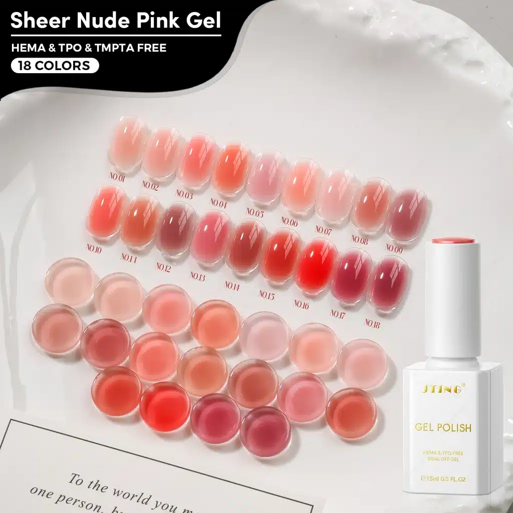
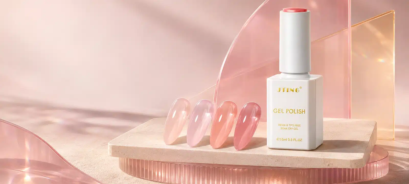
JTING’s Sheer Nude Pink Gel collection gives salons and distributors 18 shades of translucent color, from pale peach and soft pink to coral, rose and red. One thin coat leaves the nail visible through a soft tint. A second brings out more of the shade while keeping the finish translucent. The palest colors offer a light nude finish, while the stronger shades bring more visible color to the same sheer look.
The self-leveling formula spreads evenly in thin coats and is HEMA-, TPO- and TMPTA-free. Each shade comes in a 15 ml bottle and carries a number from No.01 to No.18. If you already stock opaque nudes, start by comparing the light peach and soft pink with your current range. If you want to show how far this finish can go, add a warm coral and a deeper rose or red. The swatch comparisons, launch assortments and sample worksheet below show how to make those choices.
01. What Sheer Nude Pink Gel Adds to a Salon Range
A sheer nude gel polish makes the nail underneath part of the color. On a lightly tinted swatch, the outline of the underlying nail stays visible and the polish changes its tone. A creamy nude gives a softer, more diffused appearance, while a full-coverage nude creates a more uniform block of color. The first decision for a buyer is which of those results customers are asking for. A salon that already has several opaque pinks can add a sheer option without asking its team to explain why two bottles that look nearly identical have been given different names.
The pale shades in Sheer Nude Pink Gel are useful where the customer wants visible nail detail with a peach or pink tint. Deeper shades retain the same basic idea but make the color itself a more prominent part of the manicure. This allows a supplier to present the collection as a range of depths within one finish. A sales representative can begin with a customer’s existing best-matched nude, put a sheer sample beside it and show the difference immediately. The comparison is especially useful at a counter, where a shopper may have a photo of a finished manicure and no words for the amount of coverage it shows.
For a brand, that distinction can guide where the collection lives in the catalogue. Place it where a buyer can find sheer coverage as a finish, then let shoppers filter by undertone and depth. For a distributor working from printed pages or a physical swatch ring, put the word “sheer” beside the shade name or number so it travels with the sample. Pink alone describes the color family. “Sheer pink” tells the salon what the color will look like on a nail.
02. Show What Changes From One Coat to Two
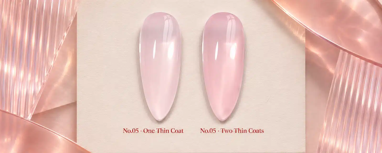
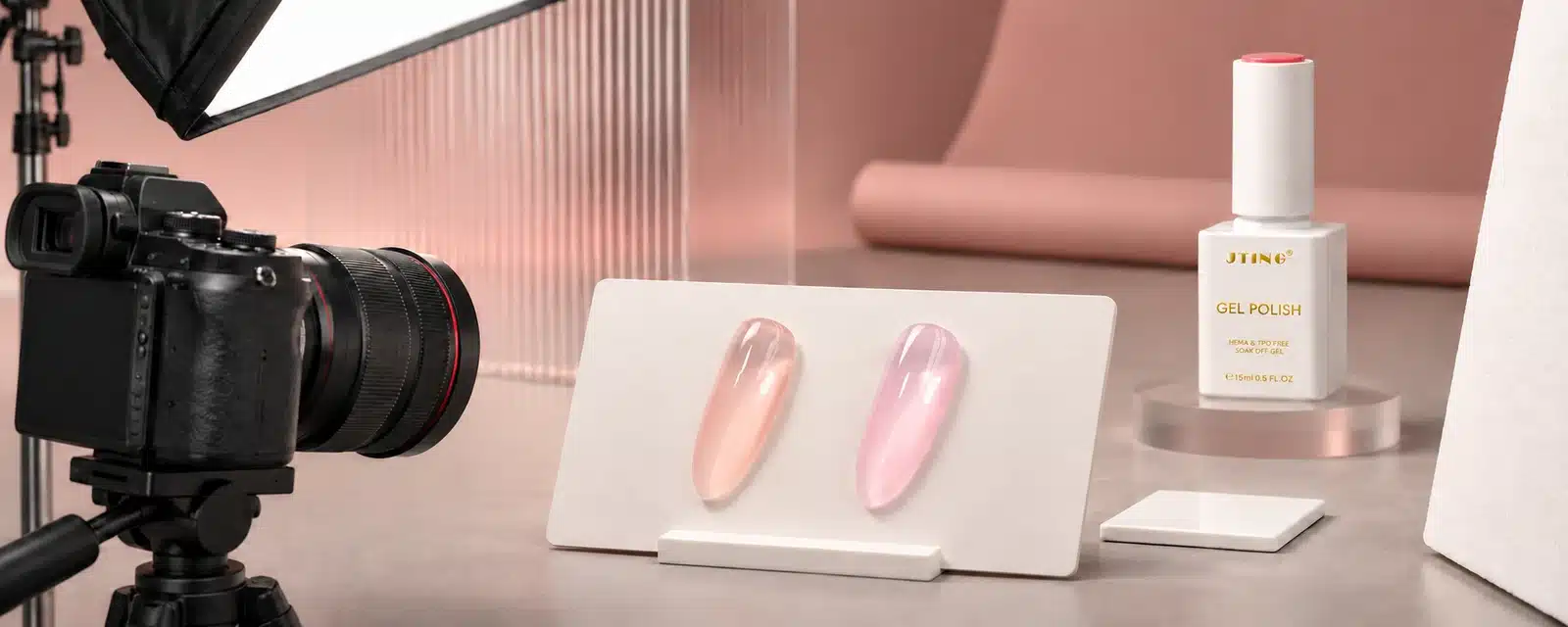
The most informative picture of a sheer pink gel nail polish is a matched pair. Show one and two thin coats of the same shade on tips of the same material and shape. Keep the background and exposure constant. In the lighter sample the buyer can see how much of the base remains visible. In the deeper sample they can judge how strongly the shade reads once more color is present. A single photo of the darker sample can make a sheer product look like a conventional pink, while showing only the first coat can make two shades look more alike than they will in service.
| What to Compare | One Thin Coat | Two Thin Coats |
|---|---|---|
| Visible base | More of the nail or sample base shows through | The shade reads more strongly while retaining its translucent character |
| Useful sales example | A light nude tint or an understated service | A more visible pink, peach or coral finish |
| What to label | Shade number, base and coat count | The same shade number and base, with the second coat identified |
The comparison is also a way to check whether a shade has enough range to support two service results. A salon may use the lighter depth for a natural-looking manicure and show the deeper finish to someone who wants their pink to read more clearly. A brand can show both in one listing without creating a second product option. The swatch should carry the same number in both pictures, including when the images are resized or broken out into a catalogue.
When reviewing the sample in person, look first for evenness across the center and sides and then at the amount of color. The self-leveling formula is designed to spread evenly in thin coats. With a sheer shade, any difference in how heavily the color is laid down is easier to see because the underlying base contributes to the result. A matched comparison helps the buying team tell whether the difference comes from the shade, the sample base or the amount of product. Keep the accepted pair so photography and future sample reviews can start from the same reference.
03. Where Sheer, Jelly, Milky and Opaque Pinks Fit
The terms buyers encounter in listings describe several different aspects of a manicure. “Sheer” points to coverage. Jelly gel nail polish is commonly described by its clear, tinted appearance, which is most apparent as color deepens. “Milky” describes a soft, diffused look with a veil over the base. “Opaque” describes coverage that largely hides the base. In a jelly pink gel polish, the clear tint is easiest to see when the shade has enough depth to stand out against the base. A light peach or soft pink can show the same translucency as an everyday nude. A buyer comparing a sheer finish with a milky one will notice the difference most readily at the edge of the same sample base.
| Requested Look | What the Buyer Should See on a Swatch | Where It Belongs in the Range |
|---|---|---|
| Sheer nude pink | The base shows through a light, even pink tint | Everyday nudes, natural-looking salon services |
| Jelly pink or coral | Translucent color with a more pronounced tint at greater depth | Brighter sheer shades and seasonal accents |
| Milky pink | A soft veil that diffuses the base | A separate finish option for customers who want more visual softness |
| Opaque nude pink | A more uniform color with little base showing | Full-coverage neutrals and solid-color services |
In a catalogue, use a swatch with a visible edge or a reference base so the buyer can understand the difference without a technical explanation. This is particularly useful for pale pinks, where a heavily exposed photo can make a sheer and a milky shade look almost identical. In a salon, keep the alternatives together on the board. Buyers can choose which finish to stock after they have seen the physical difference, while staff get a simpler way to explain it.
For a supplier already carrying milky and opaque nudes, keep the sheer swatch beside those references. This lets a salon order by the amount of base it wants to show. If a finished styling photo shows a matte version of the look, label it separately so buyers can identify the finish they are seeing.
04. Read the 18 Shades by Undertone and Depth
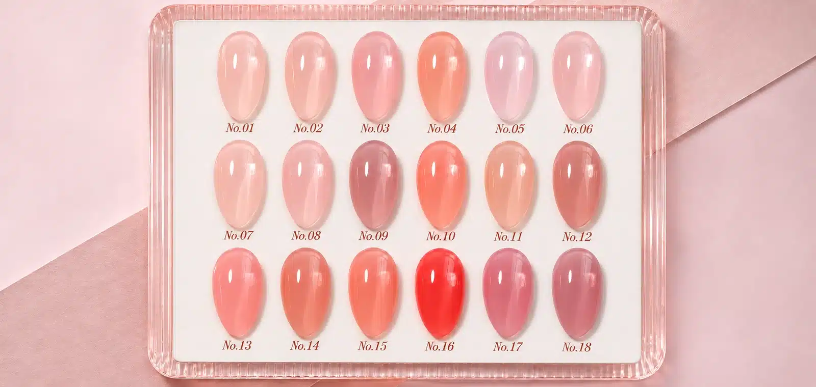
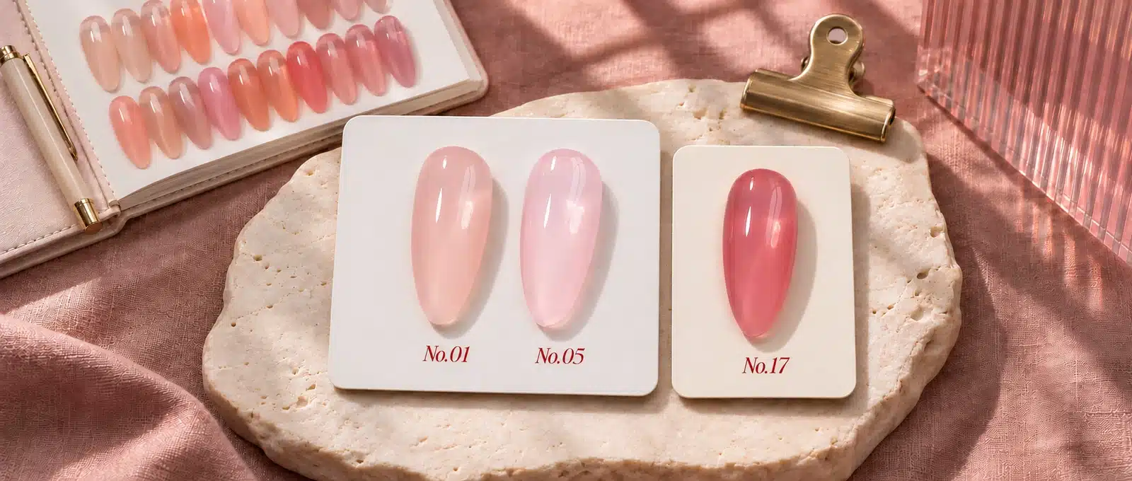
No.01 pale peach and No.05 soft pink are a useful starting pair. They occupy a similar place in an everyday nude range, but the color leans in different directions. Put them next to the nudes that already sell through your channel. A peach tint gives a buyer a warmer option, while a soft pink adds a rosier choice. If your existing line already covers one of those looks well, the other may add more variety to the display.
No.04 moves toward warm coral. It gives a range a step between understated nudes and the stronger shades. At the deeper end, No.16 brings a red direction and No.17 a rose direction. Give these swatches enough room on the color chart to compare them directly. Side by side, they help a buyer choose whether the stronger end of the range should lean toward red or rose.
| Shade Reference | Color Direction | What It Adds to the Range |
|---|---|---|
| No.01 | Pale peach | A light, warmer nude choice |
| No.05 | Soft pink | An everyday sheer pink choice |
| No.04 | Warm coral | A warmer step between the light nudes and deeper accents |
| No.16 | Red | A stronger red option within the translucent finish |
| No.17 | Rose | A stronger rose option alongside the red |
On the full 18-shade chart, use these five swatches as points of reference. A buyer who starts with No.05 can look for a nearby shade with a different undertone, then move toward coral or a deeper rose if the collection needs more range. Keep the actual shade numbers visible so buyers can return to the chart and ask for the exact sample that caught their eye.
05. Formula and Finish of Sheer Nude Pink Gel
Sheer Nude Pink Gel is HEMA-, TPO- and TMPTA-free. The self-leveling formula spreads evenly in thin coats, giving the nail a smooth tint while leaving the base visible. That matters most in the palest colors. A translucent shade shows the nail or base beneath it, so an even layer helps the eye read the color across the whole nail. The two depths shown earlier give a brand or salon a way to demonstrate that range from a single bottle.
For a brand sourcing HEMA-free gel nail polish or TPO-free gel nail polish, keep the exact three exclusions with the product specification. When the sales team needs a one-line description, lead with what the buyer can see: a buildable sheer nude pink with an even finish in thin coats. The ingredient information can sit alongside that description on the sell sheet or in the product specification.
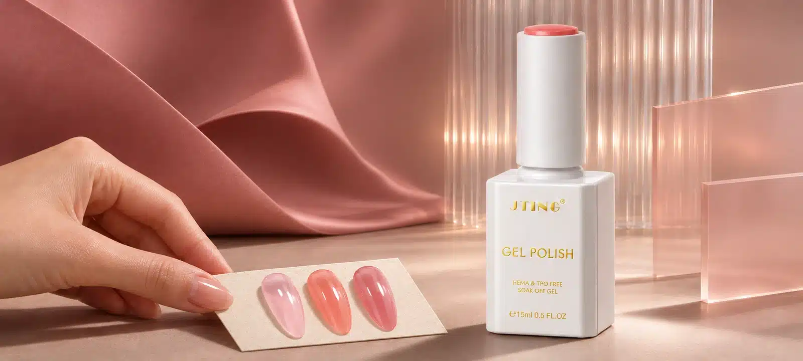
The standard white bottle holds 15 ml, measures approximately 29 mm wide × 85 mm high, and carries the shade identifier on the cap. The bottle is marked soak-off. Those details are useful when planning a shelf display, preparing bottle label artwork or requesting the first quote for a branded range.

06. Build a Focused or Expanded Launch Assortment
If you are adding sheer nudes alongside other gel nail polish color collections, start with the role each shade needs to fill. A salon supplier opening a small section for sheer nudes may need a few distinct choices customers can recognize quickly. A distributor with a larger neutral catalogue can show all 18 shades and stock a smaller selection initially. A brand with its own seasonal campaigns may choose a core of pale colors with one or two stronger accents.
| Example Assortment | Suggested Shades | Best Fit |
|---|---|---|
| Core nude pair | No.01 pale peach and No.05 soft pink | An everyday sheer offering with two clearly different undertone directions |
| Core plus two accents | No.01 and No.05, with No.04 warm coral and either No.16 red or No.17 rose | A first launch that shows both everyday color and a stronger finish |
| Expanded shade display | No.01, No.05, No.04, No.16 and No.17 as samples alongside the full 18-shade chart | A distributor that wants to present the full range while choosing stock by demand |
For the core pair, give the sales team one example of where each shade fits. No.01 can extend a warm nude offering and No.05 can serve as the soft pink option. If one of those colors closely overlaps with a shade you already carry, use the space for No.04 or reserve it for the stronger accent your accounts are asking for. The sample chart can still include the close alternative for buyers who want to compare the two.
For the expanded range, decide whether red and rose both have a distinct use in the channel. One can lead a campaign while the other remains a swatch option until it has an account or a planned release. For example, a salon supplier might present No.04 as a warmer addition to the everyday menu and use No.17 to show the rosier end of the range in a separate feature. The display gives customers a view of the collection’s breadth, and the initial assortment gives each stocked shade a job.
07. Three Finished Looks for Salon Menus
A sheer collection earns space on a salon menu when the finished nails show different results that customers can recognize. Three looks give a supplier a compact demonstration without requiring a separate shade range for every design.
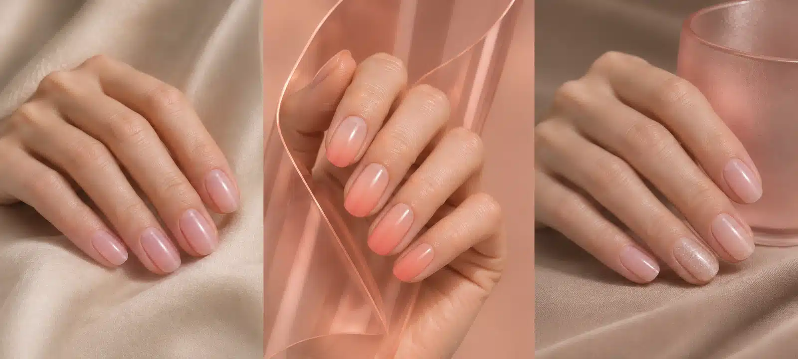
- Everyday sheer nude. A light peach or soft pink gives the nail a visible tint. The base stays visible, so the finished look reads differently from a full-coverage nude even when the two colors have similar undertones. This is the simplest look for a salon to show alongside its existing neutral menu.
- Blush or nude ombré. The finished design has a stronger area of pink or peach that fades into the surrounding color. The translucency keeps the transition visible. A completed set shows the placement of the color and how the gradient reads across several nails.
- Sheer manicure with an accent. Most nails show the plain sheer color, with a separate effect on one or two nails. A finished set gives the buyer a clear view of the base shade as well as how it sits beside the accent.
A salon supplier can lead with the everyday sheer look for regular service menus and use the gradient and accent to show why the same collection also belongs on a seasonal design board. Put the three results together on a sell sheet when space is limited. Each photo then answers a distinct question: what the shade looks like on its own, how softly it transitions and how it sits alongside a stronger design.
08. Choose the Right Base for a Fair Comparison
A sheer shade picks up what is visible underneath it. A clear display tip shows the tint with little added color. A neutral nude tip gives a closer reference for the finished service. A hand photo shows the result across the full nail and in relation to the hand. Each view answers a different question, which is why two pictures of the same bottle may look different and still be accurate.
For a color chart, use a consistent sample base so the differences between pale peach, soft pink and nearby shades are easy to compare. For a salon demonstration, add a second tip that matches the base the salon normally uses. Comparing the same shade at the same depth on both tips shows how much of the difference comes from the base. A clean edge and a consistent finish make this easier to judge than two hand photos taken under different lighting.
When reviewing a physical sample and a catalogue proof, check whether the comparison uses the same sample base and lighting. If the product photo looks warmer than the swatch, check the reference before changing the shade. It may be enough to show the sample base in the caption or use the standard display tip in the main listing. This gives salon teams a consistent starting point when they explain why a sheer pink looks slightly different on their own client examples.
For sales teams, the practical choice is which view goes first. Use the standard comparison for customers deciding between adjacent colors. Use the salon base or finished hand for customers choosing a service result. Keep both labeled when they appear together so a buyer can follow the same shade across the two views.
09. Show How Sheer Pink Works With Colors You Already Stock
For a distributor, a paired display is a way to show why a customer who already buys nude colors would add Sheer Nude Pink Gel. Start with a product the salon knows and show the combination beside it. A representative can use the same pair to sell the sheer shade on its own to an existing account or show the whole combination to a new customer.
| Existing Color or Finish | What to Put on the Display | What the Buyer Can Order |
|---|---|---|
| Neutral nude | The current nude beside the same nude with a sheer pink tint | The sheer shade as an addition to a familiar base |
| White French tip | The same white tip with a neutral nail bed and with a sheer pink nail bed | The pink nail-bed color as an addition to an existing French service |
| Cat-eye or glitter accent | A plain sheer manicure beside the same shade with one effect nail | The sheer color and the separately identified effect product |
Place one product line beneath each pair. For a French example, list the white tip product and the sheer pink nail-bed shade. If the salon already carries the white, the representative can take the order for the pink alone. For an effect look, identify the cat-eye gel or glitter separately so the customer knows what creates the accent and can order the right item.
This display also helps accounts with little room for new stock. One small card can show the pink alongside something they already reorder. If the pairing becomes a regular menu choice, the account can stock the sheer shade alongside that existing product and order the two independently as demand changes.
10. Give Each Shade a Stable Reference
The customer may see a shade in an online listing, ask about it by message and then reorder from a warehouse catalogue. The shade number needs to survive all three steps. Keep the original No.01–No.18 references for the JTING presentation. If a private label project uses its own shade names or article numbers, retain a mapping between the approved shade, the buyer’s code and the bottle identifier.
| Record | What It Should Show | Who Uses It |
|---|---|---|
| Approved sample | Shade number, reference base and shown coverage | Buying and product teams |
| Bottle label | Matching shade reference and the agreed product identification | Warehouse staff and salons |
| Color chart | A legible number next to each physical or photographed swatch | Representatives and purchasing teams |
| Online listing | The same number on the selectable option and the swatch image | Customers choosing and reordering |
| Repeat order | Agreed code, packaging version and previous order reference | Procurement and supplier teams |
Keep identification readable at the point of use. A bottle cap marker may work on a shelf but disappear from a front-facing e-commerce photo. An online listing can solve that with a shade image or a visible number in the option selector. A distributor selling individually and in groups should show the included numbers on the set listing as well as on the individual items. The same color should be easy to recognize when a salon buys a refill.
The most useful operational check is to hand someone a sample and ask them to find it in the catalogue and on the order sheet. If the connection breaks anywhere, fix the mapping before sales materials go out. This is especially important when the swatch names are translated or when a local market uses a different description for the same undertone.
11. Use a Sample Approval Record Before Buying in Bulk
Bring each swatch comparison to the sample review with a decision attached to it. If the launch needs one pale shade, the question is which shade adds the most to the current range. If a salon wants two depths from the same shade, the question is whether both depths give a clear, even result. The sample approval record keeps the buyer, sales team and supplier working from the same reference.
| Sample Pair | What to Check | What to Record for Approval |
|---|---|---|
| No.01 pale peach and No.05 soft pink | Whether the undertones are distinct at normal viewing distance on the same base | Keep both if each fills a different place in the range, or name the preferred shade for launch |
| One shade at one and two thin coats | Whether the second depth adds visible color and the tint looks even across the sample | Record the depth approved for the chart and keep both swatches if both are shown in the listing |
| No.16 red and No.17 rose | Which of the stronger shades offers the intended accent direction | Record the lead accent and any second shade to keep for future review |
| The same sheer shade on a standard tip and on the salon’s base | How the underlying base affects the color shown to customers | Record which sample goes in the catalogue and which represents the salon service |
Read the samples at the distance a buyer would use a display board. Then look more closely at the center, sides and edge of the tip. On the pale shades, the edge makes the amount of visible base easier to judge. On the deeper shades, the sample should show enough of the color to distinguish the red and rose directions. Evaluate each result under the same light before making a selection.
Keep the approved physical swatch with its shade number, base, coat count and the date of the review. If a comparison is unresolved, record one specific issue, such as “the two pale shades look too similar on the salon’s neutral tip” or “use the lighter sample in the catalogue.” That record gives the supplier and photographer an actionable reference. It also gives the receiving team a sample to compare when the first shipment arrives.
12. Give Buyers the Three Views They Need to Choose a Shade
A sheer collection needs images that show both the range and the finish. Three views give a wholesale buyer enough information to compare colors, present them to salons and identify the shade in an order.
- The full numbered shade chart. Show all 18 swatches in order so buyers can locate the shades they want to sample. Keep the shade numbers visible in the catalogue and on the mobile listing.
- A close comparison of the pale shades. Give light peach and soft pink enough space to show their different undertones. If the product listing uses two depths, identify the coat count on each sample and keep the same base and lighting across the pair.
- A finished hand-model photograph. Show the tint across a real manicure so the buyer can see the finish at service scale. Identify the shade and any separate effect that appears in the design.
Put the chart first when the customer is selecting colors for an assortment. Lead with the finished hand when a salon wants a picture for its menu. Use the close comparison beside the shade selector where the customer is choosing between two similar colors. When approving the files, check them beside the physical swatches and at the size the customer will see. Two pale colors can look distinct on the photographer’s screen and nearly identical on a small listing image.
The source files should also be easy to hand over. A distributor needs the chart with readable numbers and separate images for the shades carried. A salon may need a menu photo and a short caption it can adapt. A brand planning to reuse the material in print can approve a proof beside the physical swatch. Those checks are more useful for a buyer than a second bottle angle or an unlabeled close-up.
13. Prepare Sales Materials for Each Channel
The same collection can support several sales channels. Start with the information the buyer needs at the first meeting, then give them the assets they will use when they place an order or show the line to their customers.
| Channel | What to Show First | What to Hand Over |
|---|---|---|
| Salon supply | A finished sheer nude and one look that expands the salon’s menu | A labeled service swatch or menu image with the shade number |
| Wholesale distribution | Where the sheer shades fit next to existing nude colors | A numbered assortment sheet with stock and sample options |
| Private label | The selected shade range, finish and formula | A brief connecting the approved shades with the intended bottle and label |
| Professional e-commerce | The color and coverage of the selected shade | A matching swatch, a clear option label and the contents of the offer |
For salon visits, a representative can take the light comparison and a finished look on the same card. The comparison answers a color question, and the finished look gives the salon something it can show customers. If the account already knows the finish and is asking about a different shade, use the chart and shade references for the next conversation.
For distribution, the sales sheet needs to work for the buyer who received it after the first demonstration. Put the shades available for immediate orders in one place and show how to request a sample of a different color. This is useful when the full chart is larger than the stocked assortment. A territory manager can show all 18 shades while the ordering team uses the same sheet to see which ones it can supply through the current offer.
For professional e-commerce, a clear color selection matters most at the point of purchase. The option name should connect to the swatch without requiring the buyer to zoom into the full chart. If the customer sees a finished manicure first, the listing should take them to the exact shade used in that image. Keep the format of the selected offer visible at the same step so a shopper can choose a color and understand the contents before ordering.
14. Plan Single-Shade Reorders and Curated Offers
Individual shade orders make sense for salons that use the same color in a regular service. A curated offer is useful when a distributor wants to sell a selection built around a look or a new release. For example, a collection sheet can feature two everyday nudes and a stronger accent, while the order form gives the salon the option to replace the shade it uses most.
Decide how the two formats fit together before printing the catalogue. If a customer first buys a selection, put the individual shade reference where they can see it when they reorder. If the range is first sold shade by shade, build a curated offer around a clear reason to buy those colors together, such as covering two nude undertones and adding a warmer accent. Give the group one description and list its contents where the customer places the order.
Stock the two formats according to how accounts use them. A group promoted to new salons may need a fixed number of each color for the launch. Repeat accounts may continue buying just the everyday shades afterward. Tracking the group and the single shades separately makes the next order easier to plan. It also helps a distributor know whether a promotion is creating demand for the whole assortment or introducing one shade that should be stocked more consistently.
15. Approve Private Label Packaging and Launch Materials Together
JTING supports bottle, cap, brush and label choices for private label projects, along with color charts, product photography and video. For a sheer nude pink gel nail polish range, these assets work best when they are approved against the same selection of shades. The bottle and chart identify what is in the offer, and the photography shows the depth and undertone the buyer approved.
Begin with the product sample and a proof of the bottle label at actual size. Review the product name, net volume and shade reference on the bottle. Look at the bottle from the angle a salon or distributor will use on the shelf. If the shade number appears on the cap, check that the same number is easy to find in the chart. Where a private label uses custom shade names, keep the approved number in the buying record so the supplier can match the label to the selected color.
Next, approve the materials for the channel. A printed chart needs legible numbers and a color proof the brand can compare with its swatches. A catalogue needs a clean pack shot and enough detail to distinguish similar pinks. A short product video can show the translucent finish as the light moves across the nail. Give the photographer the approved swatch, reference base and intended depth so the files represent the agreed finish.
For a branded selection, proof one label alongside its bottle and approved swatch before signing off the set. Check that the printed identifier matches the color chart and remains readable on the bottle. If the first launch covers only part of the collection, list the included shades on the order sheet so the distributor can use the same references for orders and replenishment. JTING’s private label gel nail polish guide covers the broader packaging and sample approval process.
16. Compare Wholesale Quotations on the Same Basis
For a wholesale gel nail polish quotation, specify the number of bottles per shade, the presentation you need and the destination. Where the offer includes branded packaging, identify the bottle, cap and label to be quoted. If a chart, photography or video is part of the launch, show those items separately so you can see what each quote covers.
| Quote Line | What to Ask For | Why It Matters |
|---|---|---|
| Product and quantities | 15 ml format, selected shade numbers, bottles per shade and total units | Shows how much of each shade is included in the first order |
| Branding and packaging | Standard or branded presentation, bottle, cap and label specification | Keeps packaging differences visible when comparing bottle prices |
| Sales materials | The chart, photography or video required for the intended channel | Shows which launch materials are included and which are quoted separately |
| Schedule | Sample review, artwork approval and the planned dispatch window | Gives the buying team the dates it needs for the launch calendar |
| Repeat supply | The references to use for approved shades and packaging on a reorder | Helps the team reorder the same product and packaging later |
For example, compare a standard-bottle order and a private label order using the same shade list and quantities. The private label quote may include label artwork or sales materials that do not appear in the standard offer. Keeping those items visible lets the buyer compare the cost of the product and the cost of preparing the range for sale. If the launch needs a smaller group of colors, check whether the number of label versions and sales images also changes. That tells the buying team what it gains by narrowing the first release.
Where a distributor needs both an introductory group and single bottles for regular supply, put each format on its own line. Record what is included, which shades are being purchased for the group, and how the remaining units are allocated. This makes it easier to compare a quote that supplies the launch and ongoing sales with one that covers the launch alone.
If the quote is revised after sampling, keep the latest shade list, the approved packaging reference and the accepted quotation together. A later change in volume or packaging can otherwise leave the sales team working from different information from the warehouse. One shared record helps the teams check which shades will arrive, how they will be packed and which launch materials are included. For larger orders across several product lines, see JTING’s supply options for importers and wholesalers.
17. Size the First Order Against Your Current Nude Range
Begin with a stock report for comparable nude and pink shades and a list of confirmed commitments from salon accounts. Use the report to see which products customers reorder and the commitments to establish demand you can allocate immediately. When adding a sheer finish for the first time, existing nude sales show which color families your customers already buy. Demand for the new finish becomes clearer once salons have handled the samples and placed their first orders.
- Allocate stock to confirmed orders first. Record which accounts have selected a shade and how many units each has committed to. Keep requested swatches and tester bottles on a separate line so they do not reduce the stock available for sale.
- Look for a gap in the existing range. Give a new sheer shade a clear role, such as a light pink for a French service or a warmer tint that the current lineup lacks. If two shades fill the same role, use the approved swatches and account feedback to decide which gets the deeper opening stock.
- Choose a review date before expanding. Track requests by shade number and whether the request led to an order. When multiple accounts commit to ordering a shade that was available only as a sample, use the committed units to decide whether it should move into regular stock.
Use a worksheet with five columns: shade number, closest existing product, units committed, units reserved for display, and units available for sale. In an inventory allocation example, a warehouse has 24 bottles of one shade on hand. Eight are already allocated to salon accounts and four are set aside as testers, leaving 12 available for new orders. Apply the same calculation to each shade. That gives the sales team a realistic view of available stock and helps the buyer decide when to move a second pink from the sample board into regular stock.
For accounts that carry several nude lines, use two rows for each candidate shade: existing sales of the nearest comparable color and confirmed demand for the new sheer shade. The first row tells you which family has an established audience. The second tells you how much of the new stock is already spoken for. If a salon likes the sample but has no service date or quantity in mind, keep the interest in the sales notes. A confirmed order can go on the allocation sheet. Keeping those two records separate makes the opening purchase easier to explain when the owner reviews it a month later.
Before sending the purchase order, check how the allocation works across formats. A bottle reserved for a curated set is already committed to that format, even if the set has not sold. Keep those units separate from single bottles available to regular salon accounts. For a shade that appears in both formats, this can reveal a shortfall while there is still time to adjust the initial quantities.
18. Plan Reorders and Check Incoming Stock
When preparing a repeat purchase, review by shade rather than using total collection sales alone. Look at existing stock, confirmed customer orders and projected demand before the next delivery. Include promotional use if it affects availability. A color that is shown regularly by a representative may earn a place on the display long before it needs the same stock as the strongest repeat shade.
Keep the approved swatch available for the reorder. If the listing or packaging changed since the first order, reference the accepted version explicitly. For receiving, check the shade numbers, labels and quantities against the order. If a team raises a shade question, compare the incoming sample with the retained swatch under the same conditions and document the difference with the order details. This makes it easier to address the issue and keeps future replenishment tied to the color that was approved.
For the first review after launch, record questions alongside sales. Repeated requests for a cooler nude can point to a gap in the assortment. Frequent shade exchanges can point to a problem with the photos or naming. If the customer sees “sheer pink” in a listing but receives a shade that reads deeper on their base, ask which depth and base the listing showed. Sometimes the next purchase needs a different shade. Sometimes the existing listing needs a better comparison. Keeping those observations apart helps the buying team decide where to spend the next order budget.
When an account reports a color difference, first establish what it is comparing. Ask for the shade number, the order reference and a photo showing the sample and the reference together. If the reference is a catalogue image, check which base and coat count it represents. If the buyer has the approved physical swatch, compare it with a fresh tip under the same light. A label mismatch needs a different response from a change in how the shade was shown. Recording the distinction helps the distributor resolve the current order and decide whether to update the sales material.
19. Buyer Questions About Sheer Nude Pink Gel
How Many Shades Are in the Collection?
There are 18 numbered shades, No.01 through No.18, in 15 ml bottles. The range includes pale peach, soft pink, warm coral, rose and red directions. Use the numbered chart to identify the colors you want to sample or stock.
How Sheer Is the Finish?
One thin coat leaves more of the nail or sample base visible. A second adds color depth while keeping the finish translucent. The paired swatches show how that difference reads in the same shade.
What Formula Details Are Listed for This Collection?
Sheer Nude Pink Gel is HEMA-, TPO- and TMPTA-free. The self-leveling formula spreads evenly in thin coats.
Can I Request Samples of Selected Shades?
Yes. Send JTING the shade numbers you want to compare. For a first selection, No.01 and No.05 show two light directions, while No.04 or one of the stronger shades adds a clearer contrast. If the samples are for a particular service or catalogue, include the finish you want to show.
How Is a Wholesale Quote Built for Selected Shades?
Share the shades, quantity per shade and total quantity. JTING uses those details along with the packaging format and destination to quote the proposed order. State whether you want individual bottles, a curated group or a branded range so the quote covers the intended presentation.
How Do Minimum Order Quantities Work?
JTING’s general starting points are 10 pieces per shade for private label gel nail polish and 100 pieces for mixed-color JTING-brand orders. The final minimum depends on the product and packaging or customization required.
What Can JTING Provide for a Private Label Launch?
JTING supports bottle labels, color charts, product photography and video. Start with the approved shade selection, then identify the packaging and sales materials the launch will need.
20. Request Shade Samples or a Wholesale Quotation
To start with samples, send JTING the shade numbers you want to see or describe the gap in your current nude range. A pale peach and a soft pink make a useful comparison for a core selection. Add a coral, rose or red if you want to see how the collection reads at the stronger end.
To request a quotation, share the selected shades, expected quantities, destination and packaging requirements. Say whether the offer will be individual bottles or a curated selection. If you are launching under your own brand, the JTING private label and OEM team can coordinate the packaging, color chart and launch assets around the shades you approve.