1. Introducing JTING Rainbow Glaze Pat Pat Gel
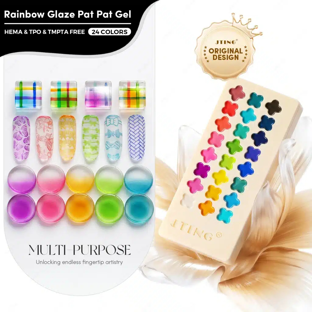
JTING introduces Rainbow Glaze Pat Pat Gel, a 24-color collection that brings translucent nail art into a distinctive clover-display palette. Separate gel compartments organize the colors, while the glass-like finish opens up a range of ombre, blush, painting, pattern-transfer and layered design directions. For professional buyers planning a new collection, the launch connects a recognizable product presentation with several practical ways to demonstrate color.
The smooth, non-flowing gel gives technicians a palette format for picking up color with suitable application tools. Its visual character comes from transparency. The color beneath, the amount applied and the arrangement of overlapping details all contribute to the finished design. A sheer wash, a concentrated blush center and a painted line can therefore communicate different uses of the same collection without suggesting that every application should look opaque.
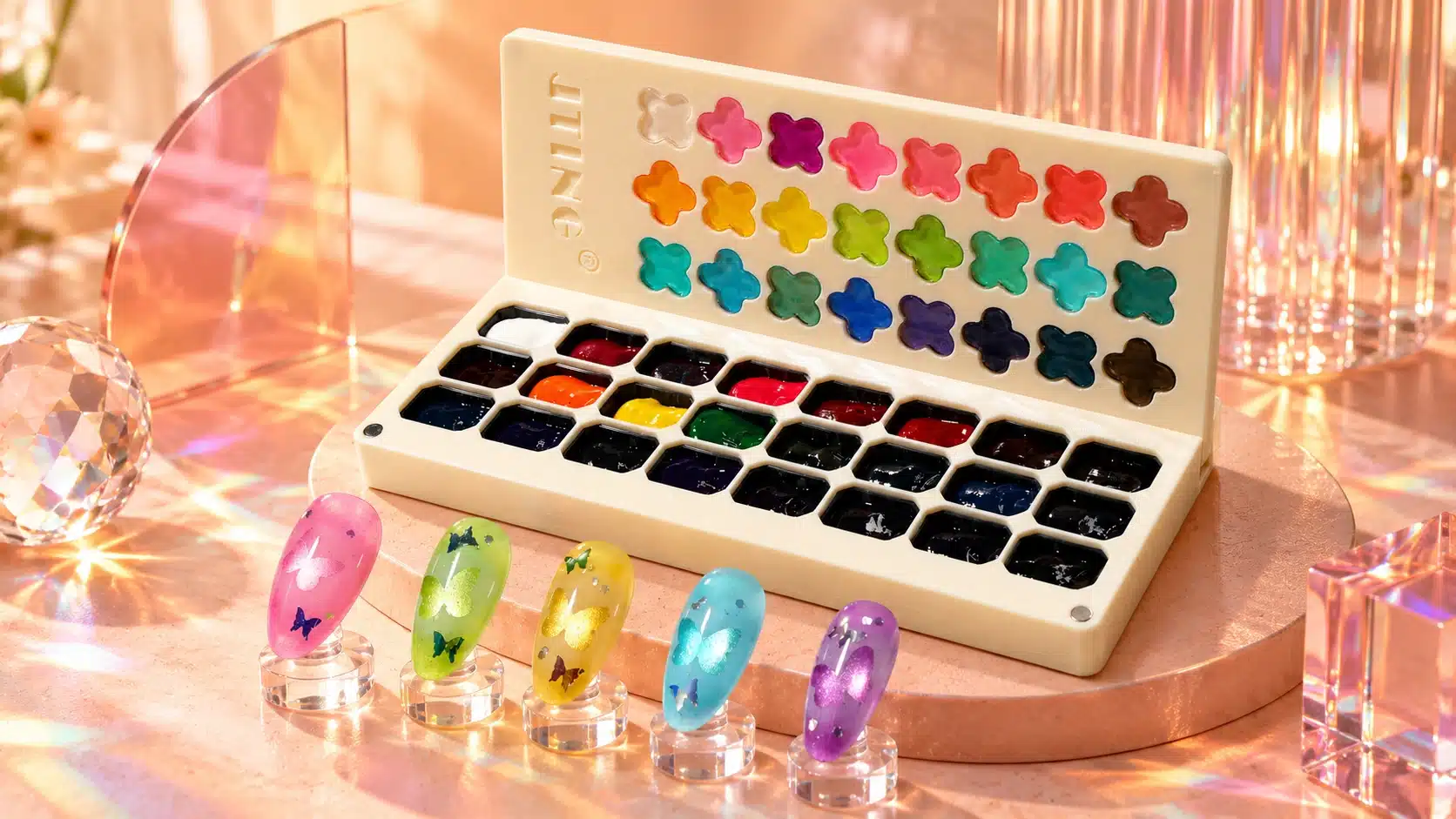
For nail brands, distributors and salon suppliers, this creates a useful starting point for product education. Buyers need to see what the palette contains, how its color behaves visually and which additional materials appear in a finished sample. A clear demonstration can connect the attractive packaging to an understandable salon application.
The current D45 Rainbow Glaze Pat Pat Gel configuration contains shades Nos. 01–24, with 3 ml in each compartment, in a palette measuring 200 × 85 × 23 mm. It requires lamp curing. Application instructions, the selected lamp and the complete working system should guide professional use.
When introducing the collection to your customers, show the open palette beside a finished sample labeled with its shade number and application. That pairing answers two immediate questions: what is supplied, and what kind of color finish is the collection designed to bring into nail art?
Explore the JTING 24-Color Rainbow Glaze Pat Pat Gel product page for the product overview. The sections below develop its practical application story, from selecting colors and preparing demonstrations to building collections that a professional buyer can explain to customers.
2. Where Translucent Pat Pat Gel Fits in a Professional Range
Start assortment planning with the visual role of the product. Rainbow Glaze Pat Pat Gel supplies translucent color for nail art. That role sits naturally beside opaque gel nail polish, detailed painting products and decorative effect systems, while giving the palette its own reason to appear in a professional range.
Make Transparency the Main Selection Criterion
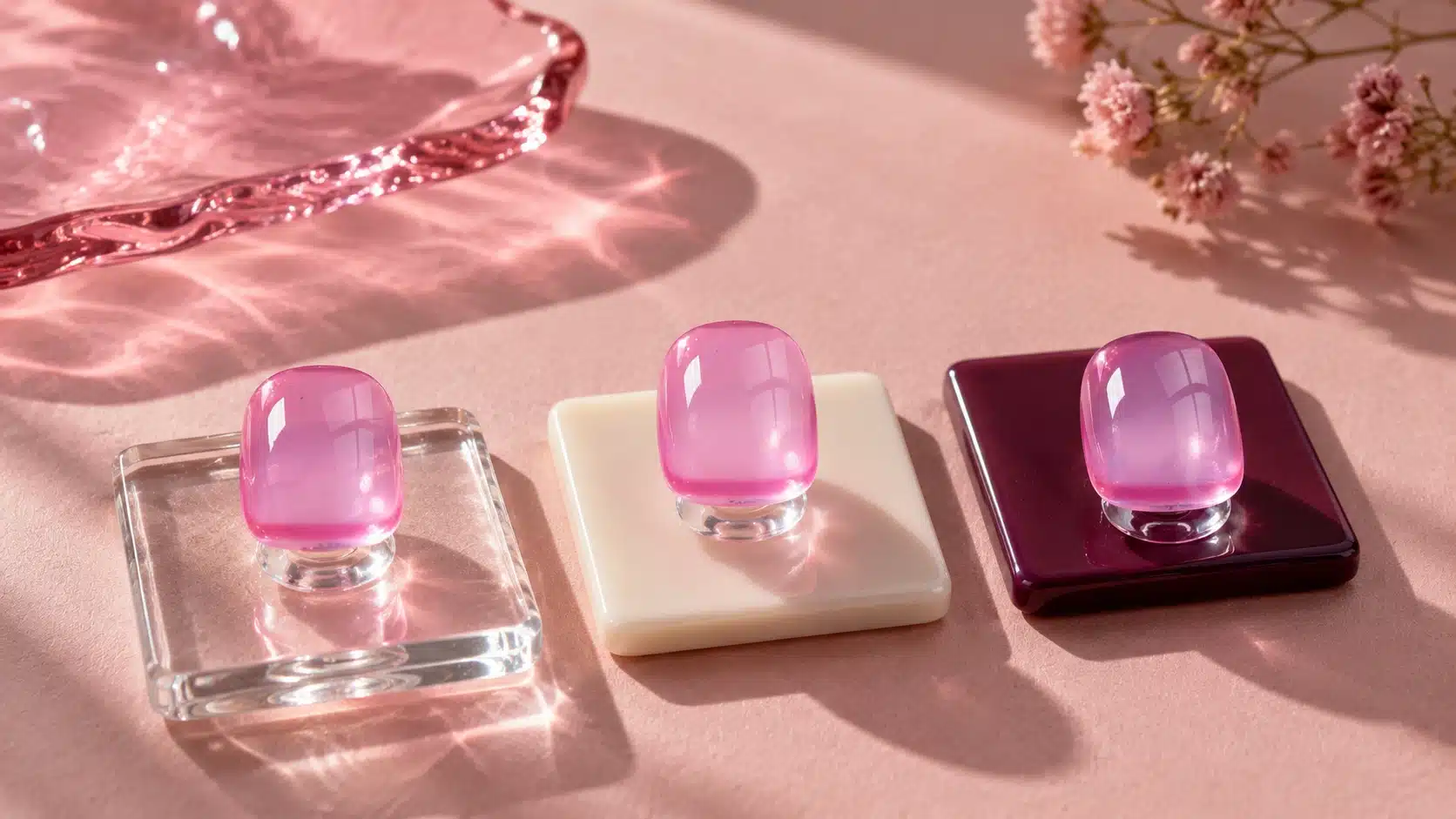
A translucent design allows its background to remain part of the composition. A pale base, a clear display tip and a decorative layer can each change what the viewer sees through the color. The practical buying question is therefore more specific than whether a shade looks bright in the palette: does it create the intended balance of color and visible detail in the proposed service?
Buyers familiar with jelly gel nail polish will recognize the idea of color that lets the background remain visible. This collection brings that visual direction into a non-flowing gel palette. JTING’s jelly gel nail polish guide provides related context for presenting translucent color. Keep the palette format, application tools and product instructions clear in the individual listing.
Give Each Product a Clear Job
| Creative Objective | Role of the Palette | Useful Demonstration |
|---|---|---|
| Soft color transitions | Translucent color placed and blended with suitable tools | A gradient with its concentrated and softened areas visible |
| Painted decoration | Color for lines, grids and translucent shapes | A close view showing line edges and overlapping areas |
| Layered visual effects | A color component within a compatible decorative system | Paired samples identifying the separate effect material |
For a distributor, these roles can become useful catalogue filters. For a salon supplier, they can become demonstration topics. For a private label brand, they connect the collection to specific services and designs that customers can explore through the sample display.
Place the product where customers already look for creative color and technique tools. A short description such as “translucent pat pat gel palette for blending and painting” can establish the format and intended use before the shopper opens a detailed demonstration.
Keep the service objective visible in every comparison. A buyer seeking full coverage needs to evaluate a product developed for that purpose. A buyer seeking see-through color needs to judge clarity, placement and interaction with the background. Presenting the palette against the correct objective makes its translucent character easier to appreciate and reduces ambiguity in both sales conversations and training.
3. The Clover Palette Design and Its Brand Story
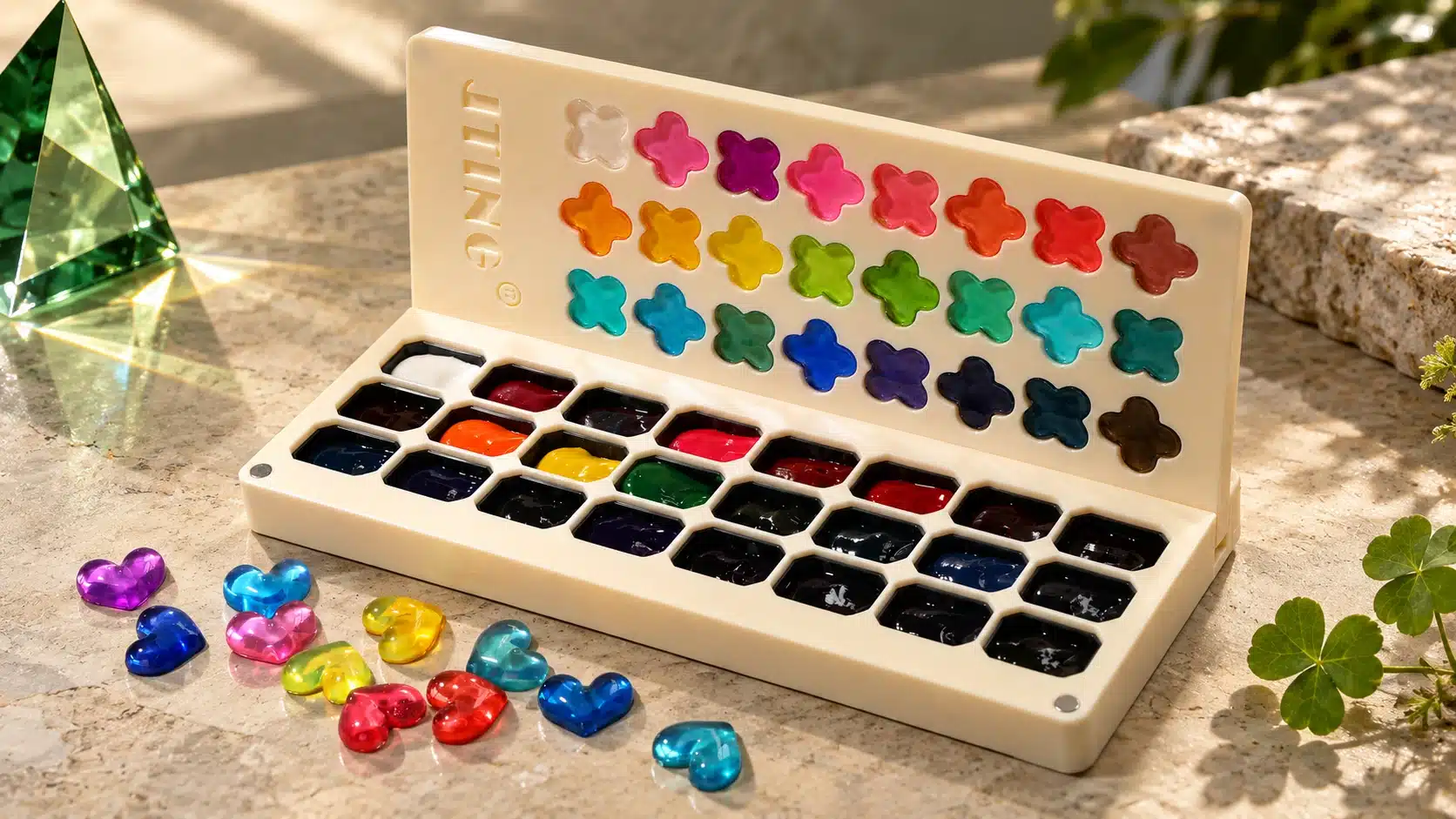
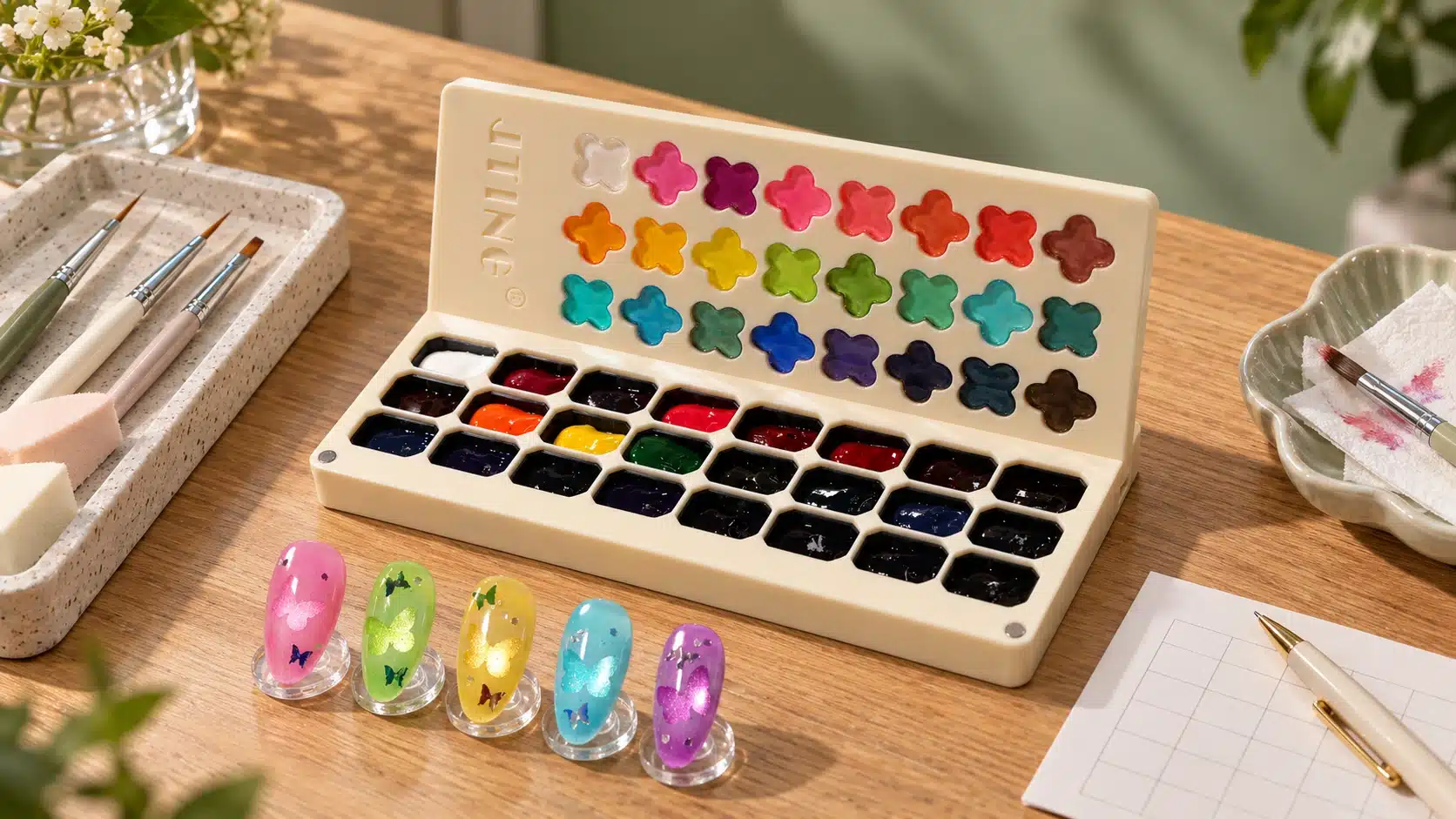
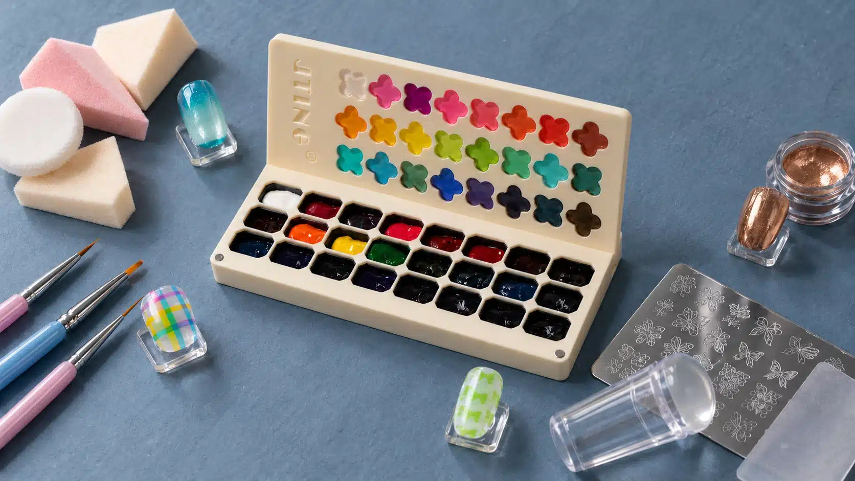
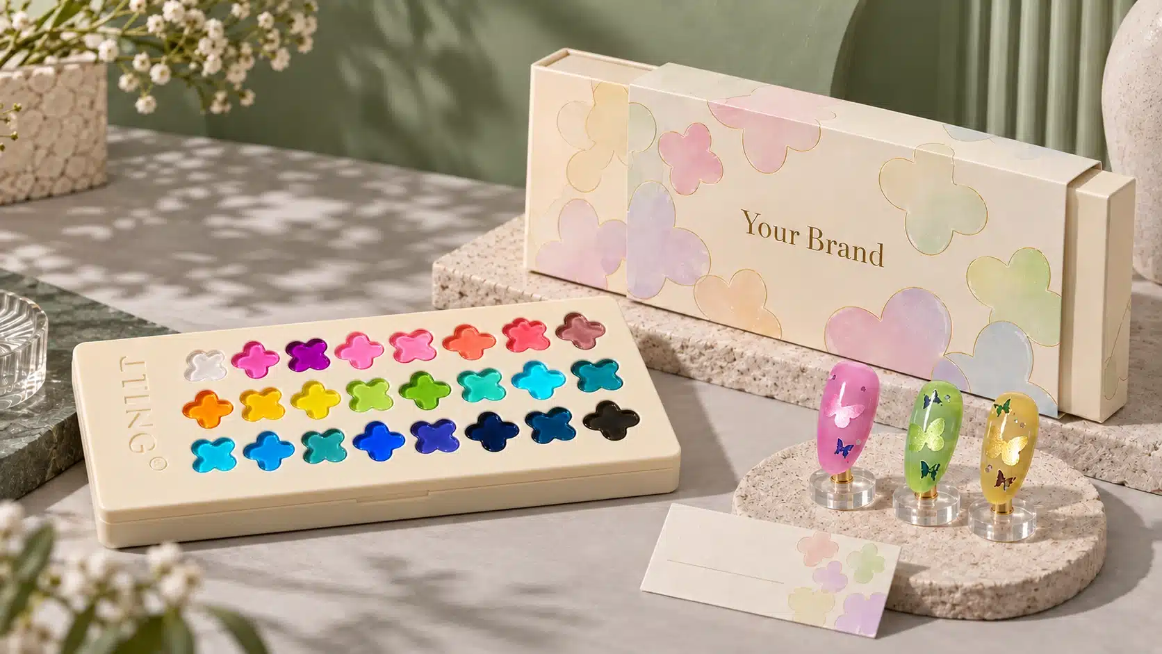
The palette has two connected presentation elements: a clover-shaped shade display in the upper cover and separate gel compartments below. One helps introduce the color collection visually; the other provides access to the material used in a demonstration. Showing both together explains the product more clearly than a closed packaging photograph alone.
Let the Physical Design Lead the Story
The four-leaf form gives the collection an identifiable visual motif. You can carry that motif into your collection launch, counter display and product photography to give customers a consistent visual reference. The strongest story begins with what the buyer can actually see: a recognizable shape, a coordinated color presentation and an organized working palette.
For example, a campaign could describe the collection through four creative directions: blend, paint, transfer and layer. Those directions connect the packaging motif to the palette’s applications. Use a finished nail sample for each direction, then place the corresponding shade numbers and tool information beside it so your customers can explore the applications.
Connect the Display to Real Application Samples
The upper display introduces the assortment, but a prepared nail tip answers a different question: how does the chosen shade appear within a working nail system? Place a numbered application swatch beside the corresponding palette view. That relationship lets buyers move from the overall color range to a particular shade and then to a finished design without losing the reference.
Use photographs that make the two levels understandable. An open view can show the shape of the display and the arrangement of the wells. A closer image can show access to a compartment. A separate application view can show the color on a prepared tip. Each image then has a distinct purpose instead of repeating the same packaging angle.
Build a Brand Presentation Around Actual Details
The 200 × 85 × 23 mm dimensions give a practical reference for planning a counter display, sample case or product photograph. Evaluate the open palette in the intended setting as well as the closed unit. Buyers should be able to read the shade references and understand where the gel sits without decorative props obscuring the product.
Keep the clover motif supportive of the collection identity. It can appear as a restrained graphic beside a product name, a shape repeated on a demonstration card or a visual introduction to the shade family. Leave enough space around the motif for legible shade numbers, product identification and application guidance on your display cards and packaging.
The clover can also support a luck-inspired gifting theme: a small wish card, a coordinated sleeve or a collection introduction built around creative possibilities. The makeup-palette presentation offers another visual reference for arranging an opening sequence and photographing the complete assortment. Keep both ideas connected to professional nail use. A gift presentation still needs clear product identification and application information; an attractive unboxing is an introduction to the collection, not a substitute for showing its finish.
For a private label presentation, coordinate the visible brand name, product description and shade numbering across the packaging concept and educational materials. Treat logo placement, label information and outer packaging as items to discuss for the agreed order configuration. An attractive mockup should remain distinguishable from the approved supplied package.
A useful brand story gives the physical design a purpose the customer can understand. Here, the clover display introduces the collection, the separate compartments organize the colors and the application samples show why those colors belong in a professional nail art range. That connection gives sales teams something concrete to explain when a buyer first opens the palette.
4. Organize Color Selection and Everyday Palette Use
Twenty-four shades become more useful when the team has a shared method for finding, demonstrating and recording them. Keep Nos. 01–24 as the stable references, then build an application swatch library around the actual palette. Descriptive names may help a campaign, but the number should remain available wherever a color is discussed for sampling or ordering.
Create a Consistent Swatch Library
Prepare the first reference set using a consistent tip type, background, application method and finishing system. Record those conditions with the set. This gives the team a practical comparison of the colors without allowing a different background or photographic treatment to become the main reason one sample appears stronger than another.
Add a second demonstration only when it answers a specific question. A shade over a different approved background can illustrate the role of the base; a detail sample can show a painted application. Label the difference clearly. A reference library works best when each additional tip explains something that the original shade swatch cannot.
Arrange References Around the Task
- For shade selection, arrange the full numbered set so the buyer can compare the assortment.
- For ombre education, group tested combinations with a visible reference to each shade used.
- For painting demonstrations, show line, shape and overlap examples beside the relevant colors.
- For layered effects, identify the companion material as well as the palette shade.
The reference board can be rearranged without changing the product’s numbering. This is useful when a salesperson needs a technique-focused presentation while the purchasing team still needs an unambiguous product reference.
When a sample is replaced or a demonstration method changes, update its accompanying record as well. Keep earlier practice attempts separate from the current reference display so a visiting buyer is not asked to choose between samples made under undocumented conditions.
Keep the Working Palette Readable
Use clean, suitable tools when picking up color and prevent one shade or companion material from entering another well. Keep tools and exposed gel away from unintended curing-light exposure, and close the palette when it is not being used. Follow the supplied storage and handling instructions rather than treating the open display as a permanent workstation arrangement.
During demonstrations, place the selected shade reference within the camera view or beside the tip holder. Record it immediately after the sample is made. This small organizational habit keeps attractive nail art connected to a reproducible product reference, which becomes particularly valuable when several trainers, salespeople or partner salons use the same collection.
5. Prepare the Tools and Application System
A useful demonstration begins with a defined working system. The palette supplies color; the chosen tools, prepared surface, lamp and finishing products determine how that color is applied and presented. Establish the combination on practice tips before using it as a customer-facing teaching example.
Match the Tool to the Visual Task
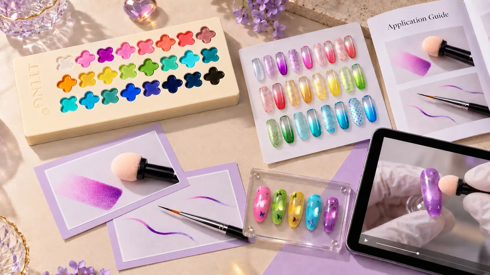
For a patted gradient or blush study, prepare a suitable sponge applicator that allows the demonstrator to control placement and inspect the contact area. For lines and geometric work, select a detail brush appropriate to the intended mark. Pattern-transfer evaluation requires the chosen plate and stamper. Prepare the tools needed for your selected techniques and check the packing list when ordering the palette or any additional accessories.
Keep a clean reference tip, a holder and a way to label samples within reach. A consistent working position helps the demonstrator show the movement clearly. It also makes it easier to distinguish a change in product placement from a change in camera angle or lighting.
Define the Complete Product Combination
Record the intended base, background color where used, Rainbow Glaze Pat Pat Gel shade and finishing product. When a companion cat-eye gel or powder is involved, include that product in the record. Follow the application and curing instructions applicable to the chosen materials, including any compatibility guidance supplied for the combination.
The JTING gel top coat guide can help frame questions about the finishing stage. The description of a gel as no-wipe concerns its surface handling after the specified cure; it does not by itself establish that every nail art design can omit a protective finishing product. Choose the finishing procedure for the complete application system.
Prepare a Demonstration That Can Be Repeated
Before filming or teaching, make a short record of the shade, tool, prepared surface and approved curing conditions. Keep the comparison samples consistent enough that the technique remains understandable. Avoid adding a second unfamiliar material while troubleshooting the first exercise.
Arrange the filming setup so the audience can see the applicator contacting the tip, not only the technician’s hand. A brief close view of the selected tool and gel compartment helps connect the material pickup to the mark that appears next.
Use professional handling procedures and keep uncured gel away from skin. A dry-looking or non-tacky surface is not a substitute for following the required curing conditions. Training should show the complete approved workflow, even when a shortened marketing video highlights only the color application. That distinction keeps an attractive demonstration connected to the information technicians need for actual use.
6. Create Ombre and Blush Effects with Pat Pat Gel
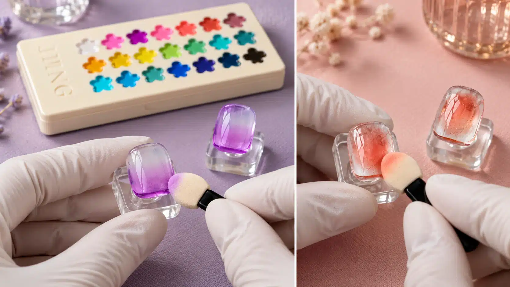
Ombre and blush designs use the distribution of color as the main visual feature. In an ombre, the eye follows a transition across the nail. In a blush or aura-style composition, attention gathers around a colored area and follows its softened boundary. Rainbow Glaze Pat Pat Gel can be presented through both directions, with the translucent finish remaining visible in the lighter areas.
Start with One Clear Design Objective
Decide whether the exercise is a tip-to-base transition, a diagonal fade or a concentrated center. Draw that intention on a separate planning card if the group is learning the technique. A clear destination for the color makes it easier to evaluate the result than an instruction to blend until it looks right.
For an initial practice sample, choose one palette shade and a prepared background approved for the system. This lets the demonstrator focus on the transition between concentrated and lighter color. Introduce additional shades after the team can explain the first sample’s placement and edge.
Observe Pickup, Contact and Color Distribution
Use a suitable sponge applicator to place the gel within the intended area. On practice tips, compare how controlled changes in the amount picked up, the contact area and the placement of repeated touches affect the visible pattern. Keep each application within the supplied thickness and curing guidance, even when you want a more concentrated center.
Look at the shape after each placement. If the colored area expands beyond the intended boundary, examine the applicator’s contact area and movement. If distinct sponge marks remain, review the tool and loading method in the practice exercise. These observations help a trainer explain the action behind the effect instead of attributing every difference to the shade.
Give Ombre a Readable Direction
For an ombre study, organize the composition so the viewer can identify the stronger color area, the transition and the lighter area. Display the tip in a consistent orientation. A fade that reads clearly from one direction may be difficult to understand in a tightly cropped image, so include the full nail shape in the main demonstration view.
When exploring two colors, record each shade separately and evaluate their visual relationship on the prepared tip. The objective is to develop an approved application example, not to assume that neighboring wells automatically form a successful gradient. Keep gels in their original compartments and use the supported layering or placement method rather than mixing formulas together.
Give Blush a Center and a Boundary
For a blush demonstration, concentrate on three visual questions: where does the center sit, how large is the colored area and how softly does it meet the background? Compare a compact center with a wider composition on separate practice tips. This gives students a way to discuss proportion without changing the shade and the entire working system at the same time.
Evaluate the whole nail as well as the close-up. The center should have an intentional relationship to the nail’s length and shape. A demonstration can show how repositioning the focal area changes the composition, while the recorded application conditions keep the comparison useful.
Complete curing and finishing according to the selected system. For a professional sample board, label the final shade, background and technique, then add a concise description such as “concentrated center with a softened perimeter.” Describe what the approved sample actually shows. This gives sales teams a precise way to introduce the palette as an ombre gel palette while teaching customers how to assess the appearance they want.
7. Explore Lines, Grids and Translucent Painting
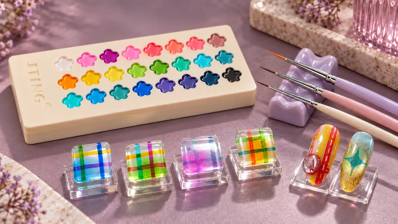
Painting introduces a different way to read translucent color. Instead of focusing on a soft fade, the viewer follows the boundaries of a line, the spacing of a grid or the overlap between shapes. Presenting Rainbow Glaze Pat Pat Gel as a nail art painting gel should therefore include examples that show both the mark and the background beneath it.
Use Lines to Teach Control
Begin a practice board with separate straight lines, curved lines and short strokes. Select a detail brush for the intended scale, then observe the effect of pickup and contact on the mark. A useful sample shows the start, middle and end of the stroke, allowing a trainer to discuss consistency without relying on a distant finished-hand photograph.
Inspect whether the line reads as a deliberate shape against the chosen background. A translucent line can be visually distinct while still allowing the base to show through. If the design calls for an opaque graphic accent, identify that as a separate material requirement rather than describing this palette as universally full coverage.
Plan Grids Around Spacing and Intersections
A grid needs an intentional rhythm. Choose the direction and spacing of the principal lines before adding a crossing set. On a practice tip, compare a more open arrangement with a closer one while retaining the same background and colors. This shows how pattern density changes the composition independently of shade selection.
Intersections deserve their own close-up because overlapping translucent color can become part of the design. Evaluate the approved sample rather than predicting an exact new color from two shade numbers. The appearance depends on the actual colors, applied amounts and working system. Record the method used so another demonstrator can reproduce the intended arrangement.
Use Open Space in Painted Motifs
Translucent painting can be explored through petals, abstract panels, ribbons or small geometric shapes. Choose a motif that suits your customers, select colors from your swatch library and develop a practice sample with your intended base and finishing products. Begin with one simple motif and judge its silhouette before filling a whole nail with detail.
Open areas allow the background to participate in the composition. A brand can use that relationship to teach the difference between outlining a shape, filling it with sheer color and overlapping a second shape. Present these as separate practice studies so the audience can see what each choice contributes.
Turn the Practice Board into a Teaching Asset
Keep successful line, grid and motif examples beside the relevant shade references. Photograph them at a scale where the edges remain visible. Add the brush type and background to the demonstration record, using the complete approved application procedure for curing and finishing. Your team can then compare this gel paint for nail art across simple strokes and finished designs, with the translucent finish clearly visible in both.
8. Evaluate Pattern Transfer with Plates and Stampers
Pattern transfer adds a useful demonstration direction, but the complete tool combination matters. The gel, engraved plate, stamper and prepared receiving surface all participate in the result. Evaluate the intended combination on practice tips before presenting a pattern as an established training example.
Begin with an Easily Read Pattern
Choose a pattern whose lines and open areas can be inspected clearly. A simple motif makes it easier to see whether an issue occurred during pickup, release or placement. Starting with a complex full-nail image can conceal where the process changed the design.
Prepare and handle the plate and stamper according to their suppliers’ guidance. Use a gel-transfer method appropriate to the selected system. Do not assume that instructions for air-dry stamping polish apply unchanged to a lamp-cured gel, or introduce an improvised cure stage during transfer.
Assess the Stages Separately
| Stage | What to Observe | What to Record |
|---|---|---|
| Pattern pickup | Whether the intended motif is present and its open areas remain readable | Plate, pattern, shade and loading method |
| Placement | Whether the motif reaches the intended position without visible distortion | Stamper and receiving surface |
| Completed sample | Whether the pattern remains clear within the finished design | The approved curing and finishing procedure |
If part of the motif is missing, compare the pattern on the stamper with the pattern on the tip. That comparison helps distinguish incomplete pickup from incomplete release. If the design is stretched or blurred, review the handling and placement method before changing several materials together.
Repeat the selected pattern on another practice tip using the same recorded method. This gives the educator a more useful reference than a single visually successful attempt. Retain notes about where the method needs attention, especially when a demonstration will be taught by another person.
Teach the Combination That Was Evaluated
Once a combination produces an acceptable demonstration sample, record the actual materials and method. Include an image of the original pattern beside the finished tip where practical. This gives the audience a fair way to judge transfer clarity instead of relying only on a photograph of the finished decoration.
Present the result as an application achieved with the identified tools and system. When changing to a different plate or stamper, repeat the pickup and transfer check before adding that combination to your training materials. A precise demonstration remains useful to a buyer because it connects the appearance to a working method that can be reviewed and taught.
9. Layer Glass Color with Cat-Eye, Chrome and Decorative Effects
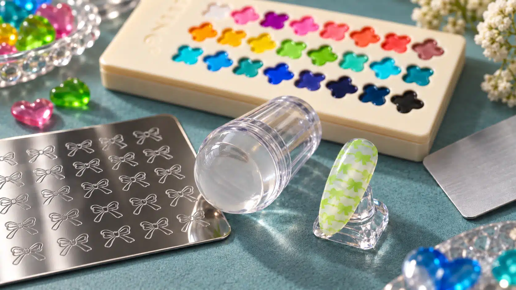
Translucent color can connect different parts of a nail art composition. It may introduce a color direction around a reflective effect, soften the visual relationship between elements or allow an underlying detail to remain visible. The palette’s role in these designs is the glass-like color. Each companion material supplies its own separate effect and requires an appropriate application system.
Keep the Source of the Cat-Eye Effect Clear
In a combination with JTING cat-eye gel, the magnetic response comes from the cat-eye product. Rainbow Glaze Pat Pat Gel does not create a magnetic effect on its own. Show the companion product in a training demonstration and identify it in the sample record so customers understand what is needed to develop the look.
Evaluate how the selected translucent color relates visually to the cat-eye feature. Observe the sample from more than one viewing angle under consistent lighting, paying attention to whether the light pattern remains readable and whether the color supports the intended composition. Record the compatible layering method actually used; a photograph alone cannot establish the correct product order.
A useful comparison board can include a reference showing the selected cat-eye effect and a second sample showing the evaluated color combination. Keep the background and presentation conditions consistent. The comparison should explain the contribution of the palette shade rather than suggesting that the palette contains magnetic pigments.
Develop Chrome and Iridescent Combinations as Complete Systems
Chrome powders and other decorative powders introduce additional variables, including the selected surface, application stage and finishing method. Use the relevant product instructions to establish the working combination. JTING’s chrome nails guide provides related information for planning the demonstration and discussing the materials involved.
During sample development, inspect whether the intended reflective appearance is visible, whether the color remains readable and whether the finish is consistent across the design. The receiving surface and application sequence depend on the selected powder and gel products. Evaluate each new combination using its corresponding instructions before adding it to your service menu.
Keep the powder and the palette gel separate during preparation. Develop the combination through the recommended application method rather than stirring powder into the wells. Record the finished system as a whole, including the finishing product, so the attractive surface shown in a photograph can be linked to the materials actually used.
Give Decorative Details Room to Remain Visible
Other decorative elements can be explored where the selected system supports them. The visual question is how much of the detail should remain visible through or beside the color. A small accent and a dense decorative arrangement ask different things of a translucent composition, so evaluate them on separate practice samples.
Consider the hierarchy before adding more material. Decide which element is the focal point, which supplies the color and which provides the background. If every part of the nail competes for attention, simplifying the design may communicate the product more clearly than adding another effect.
Label Layered Samples for Professional Buyers
Use a concise material description beside each approved sample: palette shade number, companion effect product, background and finish. Keep the approved application method in the accompanying training record. This lets a buyer separate the product being purchased from the supporting products used to demonstrate it.
For photography, include a full-tip view and a closer view where the effect benefits from detail. Keep lighting consistent across comparisons and avoid editing that changes the apparent color or reflection. A short viewing-angle sequence can help show a reflective design, while a clear still image preserves the shade reference. Together, the still images and viewing-angle sequence help your customers understand the color, reflective effect and materials required for the design.
10. Build Nail Art Collections Around the Palette
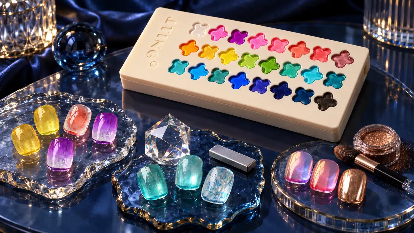
A collection becomes easier to sell and teach when its samples share a clear visual idea. Begin with the 24-color palette, select a focused application direction and develop a small group of approved designs that belong together. The objective is to show a buyer how the product can enter an existing professional offer, with each sample contributing something distinct.
Choose a Collection Theme with a Practical Purpose
A technique-led collection might concentrate on soft gradients, translucent grids or painted motifs. A finish-led collection might compare glass color alone with evaluated companion effects. A color-led collection might group shades selected from the actual swatch library. Choose the approach according to the question the buyer needs answered.
You could name a group of your blush and ombre samples “Soft Color Studies,” or organize your line and grid designs under “Glass Geometry.” Select the finished samples first, then choose a theme that makes their shared appearance easy for your customers to recognize. Keep the product name and shade references available beside each group.
Give Each Sample a Different Role
Plan the display so a buyer can progress from a simple application to a more developed composition. A reference swatch establishes the shade. A technique sample explains its handling. A finished design shows a creative use. A companion-effect sample introduces the additional materials needed for a more elaborate look.
This progression also helps a trainer choose where to begin. The group can understand the product’s basic appearance before discussing overlapping colors or effect combinations. Keep the sample descriptions short enough to scan, with the full application record available for the person responsible for training.
| Collection Direction | Sample Development Focus | Buyer Takeaway |
|---|---|---|
| Everyday glass color | A restrained sheer color application with the background visible | A clear entry point for introducing the translucent finish |
| Soft blush studies | A colored center balanced by a softened boundary and open background | A focused design direction for sponge-patting demonstrations |
| Translucent geometry | Line control, spacing and visible grid intersections | A painted collection with a different visual rhythm from soft blending |
| Colored cat-eye light | An evaluated pairing with a separately identified magnetic gel | A companion-product story with both materials clearly specified |
| Iridescent accents | A selected powder system used with the translucent color | A finish-led direction supported by an approved application example |
| Clover-inspired details | A small painted clover motif developed on practice tips | A thematic connection between the packaging and a nail art display |
Build a Useful Demonstration Package
For each selected design, prepare a finished sample, a clear image and a concise material record. Add a demonstration sequence where the technique needs movement to be understood. Keep the shade number and application objective consistent across all formats so a salesperson, educator and purchasing contact can discuss the same example.
Use the same approved samples to plan several pieces of content with different jobs: an assortment image introduces the range, a close-up explains the finish, and a technique demonstration shows the application. Reusing the underlying reference helps maintain consistency without repeating identical content in every channel.
A sales presentation can then begin with the buyer’s preferred design direction and move back to the relevant shades and materials. This makes the finished collection a practical conversation aid while preserving the information needed for later sample review and product training.
Make Selection Easy to Discuss
Invite the buyer to identify the collection direction that fits their customers and the demonstrations their team needs. Record those preferences alongside the relevant shade and material references. This turns an interest in the palette into a concrete discussion about product presentation, training and assortment fit. The selected designs then explain why the collection belongs in that buyer’s range, with each sample connected to its actual colors and materials.
11. Troubleshoot Color, Blending and Layered Results
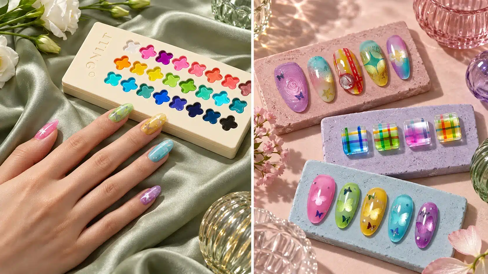
A useful troubleshooting process starts with the intended design. A translucent wash, a concentrated blush center and an overlapping grid should not look identical. Before changing the product or the application, compare the result with a reference made over the same base. Work through the relevant checks below, retaining the original sample so each adjustment can be compared with the same starting point.
Check the Base Before Adding More Color
If a shade appears darker, warmer or less clear than expected, inspect the prepared surface and the color underneath. Transparent color allows that background to contribute to the result. Repeat the same shade on a clean reference tip with the approved base, keeping the application amount consistent. This separates a background effect from a difference in the color layer itself.
If the result seems too sheer, first ask whether the buyer expected opaque coverage. For this palette, visible background detail is part of the glass color direction. Do not keep adding material simply to imitate a full coverage gel. Compare a controlled thin application with the approved layered example, following the supplied curing instructions for each stage.
Isolate the Variable in a Blended Edge
For an uneven ombre transition, review the sponge surface, the amount picked up and the area contacted with each movement. Work on a fresh tip and change one variable at a time. A heavily loaded applicator and repeated pressure on one area can produce a different visual pattern from a lighter, more distributed application. Record the effect of each adjustment so you can identify which change improves the transition.
When adjacent colors look muddy, check whether the applicator carried the previous shade into the next well. Separate gel compartments organize the collection, but clean pickup still matters. Use suitable clean tools when moving between shades and keep trial color combinations on separate practice tips, following the supported application method. Preserve an untouched comparison sample so the original shade remains available for inspection.
Trace Companion Effects to Their Own Materials
If a magnetic highlight disappears in a layered example, compare the separate cat-eye layer before and after adding translucent color. Review its magnet placement, application and curing method under that product’s instructions. Rainbow Glaze Pat Pat Gel contributes color; it does not supply the magnetic response. For powder combinations, check the selected powder, receiving surface and finishing sequence together.
For unclear transferred patterns, compare pickup from the plate with the impression on the tip. This helps locate whether the change happens at pickup or transfer. Keep the same plate, stamper and pattern while adjusting the application. If a result still cannot be repeated, send the shade number, material names, method and clear photographs with your technical enquiry. A specific comparison is more useful than a general description such as “the effect is wrong.”
12. Build a Practical Sample Evaluation Plan
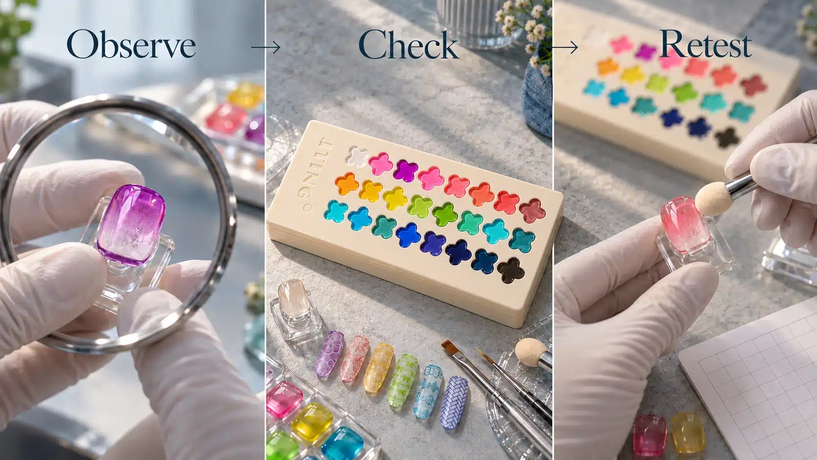
A sample should answer a business question: can your team demonstrate and sell the collection accurately with the system your customers are expected to use? Looking at the closed palette answers only part of that question. Plan the evaluation around color, handling, finished designs and the physical presentation, then keep the approved examples together as the reference for the collection.
Establish a Repeatable Starting Point
Use prepared nail tips, clearly identified base and finishing products, suitable applicators and the intended lamp. Follow the supplied instructions, and record the lamp and application conditions rather than borrowing settings from another gel. Number the sample tips to match shades 01–24. Photograph them under consistent lighting, with the same background and camera settings wherever practical.
Begin with a simple color reference for every shade. This gives the complete palette a common basis before selected colors are used in complex designs. Inspect how the underlying base remains visible and how the color reads at the center and edges of the tip. Retain the actual tips because a photograph cannot fully communicate transparency, surface appearance or changes as the viewing angle moves.
Test the Uses You Intend to Promote
| Evaluation | Suggested Sample | Decision It Supports |
|---|---|---|
| Sheer color | Numbered swatches over the planned base | Whether the displayed color matches the collection description |
| Ombre and blush | A soft transition and a concentrated center | Which application method your team can demonstrate consistently |
| Painted detail | Lines, a grid and overlapping color areas | Which design examples belong in the introductory guide |
| Pattern transfer | A named plate and stamper combination | Whether that specific tool combination should be promoted |
| Companion effects | Separately identified cat-eye and powder designs | Which combinations are suitable for your sales materials |
Review the Palette as a Working Product
Open and close the sample, identify each well and check how the clover display helps the user locate a shade. Review access with the tools planned for demonstrations. The current format holds 24 colors, with 3 ml in each compartment; the evaluation should therefore consider how a multi-color palette fits the work surface and shade selection routine, rather than assessing it as a row of individual bottles.
Ask another member of the team to repeat a selected demonstration using the written method. If the second result differs, compare tool loading, placement and the other recorded conditions to identify where the methods diverged. A successful evaluation should produce more than attractive tips: it should produce a method that your sales, education and customer service teams can explain in the same way.
Finish with three decisions for each proposed use: approved for launch, needs another comparison, or excluded from the initial presentation. Keep dated photos and the corresponding physical samples. This record lets you discuss specific adjustments with JTING and gives future photography, packaging copy and purchase approval a shared reference.
13. Create Shade Charts, Demonstrations and Sales Materials
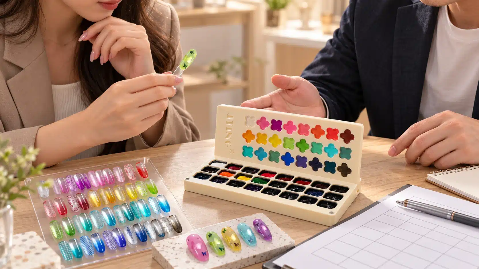
The strongest sales presentation connects three views: the palette a buyer will receive, the color it contains and the design a user can make. Showing only elaborate nail art leaves the product format unclear. Showing only the open wells makes it difficult to judge the translucent finish. Plan these views as a coordinated set, with shade numbers and application details carried through every format.
Make the Shade Chart an Ordering Reference
Use shades 01–24 consistently on the physical chart, image captions and sales sheet. Keep each number close to its swatch so it remains understandable when an image is cropped or shared. If you add descriptive shade names for your brand, keep a shade-name-to-number reference with your purchasing and sample records. Names should make the collection easier to discuss, not create uncertainty about which well a customer means.
Choose a standard base for the principal color chart and identify it. If showing a second base helps explain transparency, create a separate comparison with matching shade positions. Do not mix different bases within an unlabeled chart. The four-leaf clover display provides a recognizable view of the palette, while finished nail tip swatches provide the application reference; both have a useful role.
Build Demonstrations Around One Visible Lesson
A concise demonstration should answer one question. An ombre clip can show how the edge becomes softer. A painting example can show the intersection of two translucent colors. A layering clip can compare a prepared companion effect before and after the color layer. Keeping one lesson in focus makes the material easier for a distributor or salon educator to reuse.
Show the tool touching the product, the application on the tip and the finished result. Where editing skips curing or another necessary stage, include a clear indication of that step. Fast editing should not imply that a lamp cured gel air dries. Equally, a close crop should not conceal a separate cat-eye product or powder that is essential to the result being promoted.
Match Each Asset to a Buying Question
- A closed and open palette pair explains the clover display and separate gel compartments.
- A complete numbered chart explains the range and helps buyers reference specific shades.
- A simple sheer swatch explains the glass color character without decorative distractions.
- A technique sequence explains how the selected applicator and gel work together.
- A clearly labeled layered example explains which companion materials create the additional effect.
Use descriptive captions such as “translucent color over the demonstrated base” where they help interpret the image. Avoid adjusting saturation until a delicate transparent shade resembles an opaque neon color. Review the final files against the physical samples on more than one screen, while recognizing that screen displays still vary.
Keep a master folder with approved images, shade references, application text and the current packing description. A trade customer can then receive a consistent package of information instead of collecting fragments from separate messages. When the packaging or an application method changes, update the relevant asset and identify its revision so older promotional material does not quietly become the default.
14. Adapt the Collection for Different Sales Channels
The same 24-color palette can be presented through different buying journeys. What should change is the order of information and the demonstration, while the product identity, finish and supplied configuration stay consistent. Treat the following as ways to organize your offer around a channel’s practical questions, then test the presentation with your own buyers.
For Salon Supply and Professional Demonstrations
Lead with finished tips and the working method. A salon buyer needs to understand what can be added to a service menu and how the palette fits the station. Show a soft blush, a blended transition and a painted design alongside the open wells. Explain the base and finishing products used so the buyer can compare the demonstration with an existing system.
Keep an introductory design achievable with a clearly specified set of tools. A complex combination can follow once the basic glass color effect is understood. This creates a natural conversation about technique and companion products without presenting every decorative material in the photograph as part of the palette purchase.
For Distributors and Beauty Supply Retailers
Give staff a short explanation they can repeat accurately: 24 translucent gel colors in separate compartments, with a clover shade display, for patting, painting and selected layered applications. Support that explanation with a numbered chart and an open palette image. Staff should be able to distinguish sheer color from opaque coverage and explain that lamp curing is required.
Arrange the shelf or catalogue presentation so the full palette is recognizable before the customer explores detailed designs. Keep the packing description close to the order unit. If tools or companion gels are offered separately, make the relationship clear in the display and price information.
For E-Commerce Product Pages
Use the opening images to establish the physical product and finish, then use the gallery to teach one technique at a time. Place the 24-color count and 3 ml per compartment near the main product description. An image showing all shades, a close view of the wells and a short application sequence answer different questions and deserve distinct positions.
On your online store, help visitors identify the palette, compare its finish with the nail art they want to create and check the supplied items before ordering. Keep optional bundles visibly separate from the basic palette offer.
For an Existing Nail Brand
Position the palette according to its role in your range: a translucent nail art collection, a companion to selected effect gels, or an introduction to several color techniques. JTING’s support for private label nail brands provides a starting point for discussing that role. A focused collection story helps packaging, education and product photography communicate the same reason to buy.
15. Develop a Private Label Rainbow Glaze Pat Pat Gel Collection
A private label gel palette needs more than a logo on the outside. The product name, shade references, visual presentation and application guidance should work together as one collection. Start with the current Rainbow Glaze Pat Pat Gel format, then decide which branding changes support the way you intend to sell it. This keeps the development discussion grounded in an identifiable product.
Define the Collection Before Designing the Box
Decide which customer need the collection will address first. If your customers want soft ombre, lead with blended examples and the tools needed to create them. If they are extending an existing effect-gel range, show how the translucent palette works with selected companion products. Carry that choice into the collection name, sample board and packaging so buyers understand the intended use from their first view.
Keep the name readable and the product category clear. A creative collection name can sit alongside “24-Color Pat Pat Gel Palette” so a new buyer understands the format immediately. Through JTING’s OEM and private label development support, discuss how the approved product presentation can be coordinated with your logo, color palette and existing range.
Fit Packaging to the Actual Palette
The current palette measures 200 × 85 × 23 mm. Use the actual sample when reviewing an outer box, protective arrangement and opening experience. JTING’s custom packaging box options can inform the discussion, but the structure and internal dimensions must be matched to this palette. A box developed for bottles should not be assumed to fit a flat multi-compartment product.
Consider what the customer sees first when opening the package. The clover shade display is already a distinctive part of the presentation, so the outer design can introduce the collection without competing with it. Make the product identity easy to locate and reserve space for the approved product information. Review a physical packaging sample before relying on the appearance of a flat artwork file.
Coordinate Labels, Shade References and Instructions
JTING’s brand label and sticker support forms part of product, OEM or ODM orders; these items are not sold as a separate printing product. Discuss appropriate placement and information with the palette order. Where an existing design is suitable, adapting the brand identity and relevant text can provide a practical starting point.
Use one approved mapping for the 24 shade references across the display, instruction card and digital chart. If a different shade selection or palette structure is important to your concept, raise it as a separate development request. Changing the exterior artwork and changing the product configuration are different project scopes and should be reviewed accordingly.
Approve the gel sample, packaging sample and customer-facing copy together. Include the application methods that your team has evaluated, and discuss applicable product information for the destination market. A coherent approval package gives JTING and your team a clear reference for the collection you actually intend to launch.
16. Compare Quotations and Confirm the Supply Configuration
A meaningful price comparison starts with the unit being purchased. For Rainbow Glaze Pat Pat Gel, establish whether the quotation covers one complete 24-color palette and exactly which packaging accompanies it. A figure described only as “per piece” can be difficult to compare if another offer includes different presentation materials or uses a different order unit.
Compare the Same Product Scope
Use D45 Rainbow Glaze Pat Pat Gel as the product reference in the enquiry. Specify the current 24-color format, 3 ml per compartment, and the branding direction being discussed. Keep the product price distinct from any separately quoted packaging development, sample work, additional materials and transport. This makes it easier to understand what changes when a configuration changes.
| Quotation Item | What to Align |
|---|---|
| Product unit | Complete palette, shade arrangement and fill information |
| Brand presentation | Current presentation or agreed private label artwork |
| Outer packaging | Box structure, protective arrangement and approved information |
| Additional items | Any expressly included applicators, guides or companion products |
| Order and delivery scope | Agreed quantity, destination and the stated transport arrangement |
Tools shown in a demonstration should not be treated as included accessories unless the quotation says so. The same applies to separate cat-eye gel and powder. Keeping these items explicit allows a seller to build a deliberate bundle later without creating uncertainty about the standard palette.
Set Quantities and Timing for This Configuration
Confirm the minimum order quantity and sample and production timing against the agreed palette configuration. General bottled gel nail polish terms are not a substitute for a quote for this item. JTING’s private label gel nail polish guide can help organize broader purchasing plans, while palette quantities and schedules should be established specifically for the project.
Ask how a repeat order would be placed if the collection performs well in your own channel. Discuss whether you need whole palettes, a future revised collection or information about possible replenishment formats. Availability of individual shade refills should be confirmed directly before a retailer promises that service to customers.
Link the Order to an Approved Reference
Identify the sample and artwork version behind the final order. A clear reference includes the shade mapping, palette presentation, packing description and agreed supporting material. If an item changes during negotiation, update its description before approval. This reduces the chance that a price discussion ends with the parties remembering different versions of the collection, and gives the receiving team a practical basis for checking the shipment.
17. Plan the Collection Launch from Preview to Release
A useful launch sequence allows buyers to understand the palette before asking them to choose an offer. Build the sequence around the product’s visible strengths: organized colors, glass-like transparency and a range of nail art applications. The goal is a connected explanation that moves from first interest to a well-informed purchase, with each stage answering a new question.
Introduce the Color Direction First
For the preview, use a recognizable palette view and a simple finished design. State that the collection contains translucent gel color so the first impression matches the actual finish. A short view of the clover display opening to the separate wells can establish the physical format, followed by a clear tip that shows light passing through the color.
Avoid presenting every technique in the first asset. A crowded introduction can obscure the reason the collection is different from a conventional opaque range. Select one leading use, then let later content reveal the broader application range. This provides a sequence of useful explanations instead of repeatedly posting the same product photograph.
Follow Interest with Demonstration
Next, show a small series built from your approved samples. One demonstration can focus on a soft ombre edge, another on painted lines and transparent overlaps, and a third on a clearly identified companion effect. Use the same shade references across the series so viewers can connect a design back to the palette rather than treating every post as an unrelated manicure.
Give sales staff access to these demonstrations before the collection goes on sale. They should know which products appear in each example and where to find the relevant application guidance. Capture the questions raised during staff training; unclear points are often easier to resolve before they become repeated customer conversations.
Release a Complete Buying Presentation
At release, bring together the numbered chart, product images, packing description and essential use information. Make the difference between the palette and optional companion products visible. A customer arriving from a dramatic layered design should still be able to identify the translucent color product being purchased and understand which additional materials produced the featured result.
Use the confirmed supply schedule to plan availability messages. Coordinate product photography and packaging approval early enough that the listing reflects the actual order. If launch content was produced from a development sample, compare it with the approved presentation and replace any outdated details before publication.
Give Each Channel a Clear Next Step
A distributor presentation may lead to sample evaluation, while a retail product page may lead to the selected palette configuration. An educational post may lead to the full technique demonstration. Keep that next step consistent with the information already shown. The launch then becomes a progression from seeing the effect, to understanding the method, to choosing the appropriate product offer.
18. Review Buyer Feedback and Plan Reorders
After release, useful feedback connects a customer’s experience to a shade, a technique and a product configuration. A comment such as “the colors are beautiful” is encouraging, but a note identifying which shades were used for a blush service gives you more information for education and future assortment planning. Keep a record of both positive observations and unresolved questions, then look for recurring needs across your own customers before changing the assortment.
Separate Preference from Application Questions
Group feedback by what it actually describes. A request for a different color family concerns the assortment. Difficulty reproducing a gradient concerns the demonstrated method or working system. A question about whether a powder is included concerns the offer description. Treating these as separate issues helps you make the appropriate change instead of assuming every question requires a product revision.
For application enquiries, record the shade number, base, tool, lamp and finishing materials when relevant. Compare the reported method with the approved guide. If the information is incomplete, ask for the missing details before giving a technical conclusion. An accurate response can then become an improved explanation for future buyers.
Understand Which Demonstrations Help Customers
Review which content brings useful questions and which content leaves buyers confused. A dramatic cat-eye combination may attract attention while a simple ombre demonstration explains the palette more clearly. Evaluate those roles separately. Use actual enquiries and your own channel data to decide whether the next content should teach a technique, clarify the supplied items or introduce another shade pairing.
Keep the full collection visible even when a few designs attract most attention. Highlighting favorite shades in content does not automatically mean the rest of the palette has no value. Other colors may become more relevant when demonstrated over a different base or used as part of a coordinated design.
Reorder Against the Collection You Approved
Review remaining stock, committed demand and the confirmed supply schedule before placing a repeat order. Reference the approved palette and packaging versions, then identify any changes explicitly. A straight repeat order and a revised collection should be discussed as different scopes, particularly when artwork, shade selection or presentation materials change.
If some wells are used more quickly than others, record that pattern rather than promising an individual refill solution immediately. Discuss the requirement with JTING and use the available supply options to plan the next step. Over time, these specific observations can support better demonstrations, more accurate product descriptions and a more deliberate decision about whether to repeat the existing palette or develop a separate collection concept.
19. Frequently Asked Questions About Rainbow Glaze Pat Pat Gel
What Is Rainbow Glaze Pat Pat Gel?
It is a 24-color nail art gel palette with a translucent, glass-like finish. The smooth, non-flowing gel can be used for sponge-patted ombre, blush effects, painting, pattern transfer and sheer layering. It brings multiple colors into one organized format with separate gel wells and a distinctive clover-shaped shade display.
Is the Color Translucent or Fully Opaque?
The color is translucent. The base and underlying details contribute to the finished appearance, even when the shade looks vivid. Show it over the intended base to judge the result accurately. If your project requires solid coverage that hides the background, evaluate that requirement separately instead of treating glass color as an opaque coating.
How Many Colors and How Much Gel Does the Palette Hold?
The current palette contains 24 colors, identified as Nos. 01–24, with 3 ml per compartment. The palette measures 200 × 85 × 23 mm. Use the individual compartment volume when describing the product, and keep shade numbers consistent across the physical display, swatch chart and ordering information.
Does It Need a UV or LED Lamp?
Rainbow Glaze Pat Pat Gel requires lamp curing and is not an air-dry polish. Follow the supplied instructions and confirm the curing conditions for the selected lamp and application system. A curing time copied from another product is not an appropriate specification for this palette, and surface appearance alone should not define the curing method.
Does No-Wipe Mean That a Top Coat Is Unnecessary?
No-wipe and no-top-coat describe different things. No-wipe refers to surface handling after the specified cure. The required finishing steps still depend on the complete design and the products used with it. Follow the approved application method, especially for layered designs and powder combinations, and confirm the finishing product when evaluating the complete result.
Can It Create a Cat-Eye Effect by Itself?
No. The palette supplies translucent color, while a separate cat-eye gel supplies the magnetic effect. Demonstrations should identify both products and show how they are combined. Evaluate the selected pairing as a complete system so that customers can reproduce the intended look without expecting magnetic movement from the color palette alone.
Can It Be Used with Chrome or Iridescent Powder?
Powder combinations are among the demonstrated applications. The powder is a separate material, and the receiving surface, curing stage and finishing sequence need to suit that chosen system. Keep an approved sample and method for each combination you promote rather than assuming every powder will produce the same result.
Are Sponges, Brushes and Companion Products Included?
Confirm the included items in the specific quotation. Applicators, stampers, powders and companion gels used in product demonstrations should not automatically be treated as part of the supplied palette. A precise packing description lets distributors and retailers distinguish the standard product from any optional bundle they choose to offer.
Can Individual Colors Be Refilled or Reordered Separately?
Discuss individual shade replenishment directly with JTING when planning your order. The standard product reference is the complete 24-color palette; confirm whether a suitable separate replenishment option is available for your project. If uneven shade consumption is important to your business model, raise it during sample and supply planning before advertising a refill service.
Can JTING Supply a Private Label Gel Palette?
JTING supports discussion of branding, labels, outer packaging and coordinated collection presentation. Start with the current format and your intended sales channel. A different shade arrangement or palette structure requires a separate development review. Match the packaging to the physical palette and approve the product, artwork and application information together.
What Are the Minimum Order Quantity and Production Time?
Request a quotation for the agreed Rainbow Glaze Pat Pat Gel configuration. Quantity and timing depend on the actual product and branding scope, so general bottled gel nail polish terms should not be applied automatically. Identify your intended quantity, packaging direction and destination so the project can be discussed on a consistent basis.
20. Plan Your Rainbow Glaze Pat Pat Gel Project with JTING
A successful palette project connects the physical product with an understandable color story. Rainbow Glaze Pat Pat Gel offers 24 translucent shades, separate gel compartments and a clover display that can support a recognizable collection presentation. Its value becomes easier to explain when buyers can see the plain color, follow a selected technique and identify the materials used in a layered result.
Start with the application you want your customers to learn first. Build a small set of approved demonstrations around that use, then connect the shade chart, product description and packaging to the same references. This gives a wholesale or private label discussion a concrete starting point and helps your team prepare useful sales material while the supply configuration is being reviewed.
Explore the JTING 24-Color Rainbow Glaze Pat Pat Gel for the product overview. To discuss samples or a branded collection, contact JTING with your sales channel, expected quantity and packaging direction. Reference D45 Rainbow Glaze Pat Pat Gel so the conversation can focus on the right palette, its application examples and the configuration that fits your project.